This is my second post today!
I have the great thrill and honor of being the September guest at The Card Concept. It is a fabulous challenge that gives an inspiration photo, then uses the inspiration in different card styles. Their defined card styles are: Clean and Simple, Clean and Layered, Shabby Chic and Vintage, Clean and Graphic, and Freestyle Collage. I was asked to be a "Clean and Layered" guest which describes my style perfectly!
- Clean lines
- Lots of layers
- Designer papers/embossing
- Embellishments/accents
- Clean and fresh looking
- Some colored images at times
- White space
This is the inspiration for the new challenge:
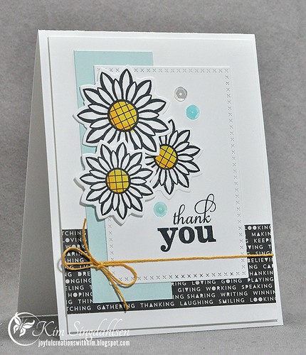
I didn't venture too far away from the graphic with my flowers and colors. When I first looked at the photo, I got the impression that the box of flowers was sitting on a newspaper. Now that I look again, I don't think it is - but I'm happy it sent me looking for my black strip of print paper.

I'm hoping my card fits right into the Clean and Layered definition!! Definitely clean lines, a few layers, some patterns, twine and sequins, some coloring, lots of white space...check!!
I think most of us have already discovered The Card Concept, but if not be sure to check it out. Even if you don't play along, it's a great place to browse and to figure out the styles that work for you.
SUPPLY LIST


I think the perfect card for the inspiration Kim! So glad to have you join us this month.
ReplyDeleteSo pleased to have you join us as GD and this is one stunning card.I think the card perfectly fits the style and the layer of text really grounds the image x
ReplyDeleteThis card is perfection! You are definitely an inspiration to me in the CAS style!
ReplyDeleteWhat a beautiful clean and layered card. I love the newsprint, and it DOES kind of look like the box is sitting on some! So fun to have you join us this month at TCC!
ReplyDeleteYou nailed this challenge!! I love those graphic flowers and the way you layered everything on this card. Beautiful design!
ReplyDeleteI love this!! The way you everything layered is just stunning!! & the text background is just gorgeous against that pretty blue. Lovely!!
ReplyDeleteLove, love, love this card! I have that stamp set, so I feel a CASE coming on!!!!
ReplyDeleteYAY Kim, congrats on guesting this month!! Your card is so pretty, love the flowers and the strip of text paper!!
ReplyDeleteKim your card is fabulous! I'm so glad that you joined us :)
ReplyDeleteBeautiful card! I just love this wonderful color combination! GREAT job as a guest designer! LOVE it!
ReplyDeleteTake Care!
Michele
Love those flowers and the bit of black to anchor things.
ReplyDeleteCheering and applauding your GD role, Kim and WOW! What a stunning card you've created with the beautiful daisies and printed paper. In awe...
ReplyDelete~c
Wowzers! Perfect selection of papers and colors :)
ReplyDeleteWhoo hoo on the GD appearance!! Rocked the photo and way to flash the Verve :)
ReplyDeleteSaw you over at the Card Concept, Kim ... congratulations on your GD spot! Gorgeous card ... crisp, fresh, pretty ... and such lovely layers! Anita :)
ReplyDeleteBeautiful card - so crisp and clean and using some of my favorite Verve stamps!
ReplyDeleteVery nice, I love the blend of colours and papers.
ReplyDeletegorgeous card Kim, so glad you are guest designing with us this month at the Card Concept!
ReplyDeleteSo perfect! I love the added twine!
ReplyDeleteDeanne :)
Beautiful card! Glad you joined us as Guest DT!
ReplyDeleteLilian TCC DT
The Leaf Studio
Beautiful card! Glad you joined us as Guest DT!
ReplyDeleteLilian TCC DT
The Leaf Studio
Well ... this is such an eye catcher. Typical Kim style ... just the way I love it! Sigh ... very envious of your talent, Kim! xx
ReplyDeleteSuper to have you Guest Designing with us at TCCC.
ReplyDeleteLOVE the daisies and pops of black!