Friday, May 30, 2014

CASE this Sketch with Reverse Confetti

The new sketch at CAS(E) this Sketch caught my eye because it works exactly with the Doin' the Wave die that I recently got from Reverse Confetti.  I decided to also play along with the Reverse Confetti Color Challenge and make a melting heart in bright colors. Unfortunately, that color challenge ended yesterday but I want to credit them anyway.

Melt


May14ColorChallenge

I got this card done and then an idea started to take shape.  A long-time friend (since we were 2 years old) lost her battle to cancer a year and a half ago. I have really needed to make a card for her husband but just didn't know what to do.   May would have been their wedding anniversary and June would have been her birthday.  I want him to know that I haven't forgotten. I had a trio of blue colors out from a card earlier this week and I had a stamp out that I had used for Memorial Day.  I thought that the blues would look like tears.

Cry

I'm thinking it's a few too many sequins for this man who is a firefighter and a mountain climber, but it was made with love and he'll know that.

You Melt My Heart
  • Stamps: Reverse Confetti Let's Chill
  • Paper: My Favorite Things Razzleberry, Cotton Candy, Orange Fizz, vellum
  • Ink: Memento Black, Versamark
  • Accessories: Reverse Confetti Doin' the Wave dies, Stampin' Up Heat and Stick Powder, Martha Stewart Crystal Fine Glitter, various enamel dots
Cry, Laugh, Remember
  • Stamps: Hero Arts Remember clear set
  • Paper: My Favorite Things Sno Cone, Berrylicious, Blue Raspberry
  • Ink: Memento Black
  • Accessories: Reverse Confetti Doin' the Wave dies, Doodlebug Swimming Pool sequins, Pretty Pink Posh Sparkling Clear sequins in 4 mm and 6 mm


Thursday, May 29, 2014

Ombre AND Chevrons: Missing You

A week ago, I was writing that I never quite knew what to do with cover plate dies.  About the same time, I was hitting the "confirm order" button on an order with a new cover plate.  (Sometimes I wonder about myself!)  But this one was so different and really cute...chevron and ombre all in one place!

Wishing You

I still struggled with it (but don't judge the plate on that - I even struggle with patterned paper!)  I absolutely the series of blues in the Simon Says Stamp line, so I stuck with my favorite blues and kept the card simple!

I am submitting this to the current Anything Goes challenge at Simon Says Stamp.
  • Stamps: Simon Says Stamp Square Sayings
  • Paper: Simon Says Sea Glass, Surf Blue and Audrey Blue
  • Ink: Memento Black
  • Accessories: Frantic Stamper Ombre Chevron Card Panel, My Favorite Things Rectangle Frames, Simon Says Stamp Medium Tags die, Clearly Beloved sequins (ordered from Simon Says), Hemptique 10-lb black twine, Queen & Co heart embellishment (from my very old stash box)

Tuesday, May 27, 2014

Getting Sketch with Catered Mojo! Butterflies!


The new challenge at Catered Crop is Garden Party.  I absolutely love how Linda introduces each challenge with a quote...

I went to a garden party to reminisce 
          with my old friends
A chance to share old memories 
          and play our songs again.
~ lyrics by Ricky Nelson, 1972

I have flowers for you today, but I also have a kaleidoscope of butterflies - that is seriously what a group of butterflies is called.  Either that - or swarm or rabble. but doesn't kaleidoscope sound beautiful?  I think many of you have moved past shaker cards - but I am still loving them!  I recently got a die that cuts teeny tiny butterflies and decided that butterflies were very representative of a garden.

This is the first card that I made - I keep saying that shaker cards will always cheer up the recipient, so I decided a get well card would be perfect.  But after I made it, I realized it didn't work with the "party" part of the challenge so I have another to share also.

Get Well with Butterflies

There isn't quite as much confetti in this card as it looks.  Because this was such a tall shaker, I added a strip of foam adhesive towards the top of the ribbon.  This makes it a double level shaker!  I didn't want all of my punched shapes behind the green ribbon.


This card uses the current sketch at Mojo Monday.  The card is 3.5" by 5.5".


Now for a card that is more garden "party".  I am still using the teeny, tiny butterfly but went for a "celebrate" card with much brighter colors.  I would like to be in this garden!

Celebrate with Butterflies

This card uses the current sketch at My Favorite Things.


I hope you play along with the Catered Crop Garden Party challenge.  Linda always curates a Pinterest board full of inspiration when the challenge first comes out.  Then the following Sunday, she brings together all of the design team cards.  Here's this week's Pinterest board - just click anywhere on this graphic to go to the complete Pinterest board.


Get Well Soon
  • Stamps: Verve Lean on Me (flower), With Love (sentiment)
  • Paper: Echo Park Sweet Day 6x6, Papertrey Melon Berry and Lemon Tart, Stampin' Up Sage Shadow,
  • Ink: Memento Black, Copics
  • Accessories: Verve Pointed Flowers die, Spellbinders narrow rectangle die (they don't next exactly so I cut the center rectangle then used my paper trimmer to cut the border), MFT Stitched Circle STAX and Flying Butterflies die, Martha Stewart ribbon, Hemptique 10-lb Natural Twine, two sizes of hole punches
Celebrate Your Special Day
  • Stamps: My Favorite Things Birthday Greetings
  • Paper: My Favorite Things Wild Cherry, Berrylicious and Primitive White, Simon Says Stamps Sunshine, Fog and Smoke, My Mind's Eye Blink of an Eye 6x6
  • Ink: Memento Black
  • Accessories: Pretty Pink Posh 4 mm sparkling clear sequins, My Favorite Things Rectangle Frames die, Gerbera Daisy die, Flying Butterflies die, Fishtail Layers die, Berrylicious button, Hemptique 10-lb white twine

Monday, May 26, 2014

In Memory Of...


Cry, Laugh

In memory of 1st Lt. Thomas Claiborne
In honor of the entire Claiborne family

Memorial Day 2014


  • Stamps: My Favorite Things Pretty Poppies, Hero Arts Remember clear set
  • Paper: My Favorite Things Grout Gray
  • Ink: My Favorite Things Grout Gray, Simon Says Stamp Lipstick Red, Olive, Versamark
  • Accessories: My Favorite Things Pretty Poppies dies, Rectangle Frames die, Grout Gray button, Gunmetal Stickles

Sunday, May 25, 2014

Papertrey Ink May Blog Hop: Aqua and Melon

It's blop hop day at Papertrey Ink.  The challenge is to use aqua and melon.


I am always intrigued by what people do with the full cover plate dies.  I have a few of these dies, but I never seem to use them.  I actually tried on a card that I posted yesterday - but I just couldn't make it work.  So I double-challenged myself today to use one of these background dies.  I decided to use a stamp that mentions "end of the day" and "tomorrow" and I thought I could could create a sunrise/sunset look.  I decided to use the first cover die that I ever got which I am sure has never been used before.  I'm not sure that I accomplished the sunrise/sunset look - I think it would be better with a few more colors - a lighter melon and a darker aqua - but I still like the clean and fresh look of the colors.

Courage
  • Stamps: Papertrey Ink A Little Inspiration, Happy Harlequin, Heart-to-Heart 6 (the sun)
  • Paper: Papertrey Ink Aqua Mist, Melon Berry
  • Ink: Papertrey Ink Smokey Shadow, Versamark
  • Accessories: Papertrey Ink Harlequin Cover Plate die, Heart-to-Heart 6 dies, Heat and Stick Embossing Powder, Fine Crystal Glitter, clear sequins

Saturday, May 24, 2014

MFT Color Palette and Freshly Made: Hi

A few weeks back there was a sequin shaker blog hop and I made my first shaker card.  I loved it. Since then, the crafting purchases that I have made relate to shakers - frame dies, dies that cut little confetti, fun sequins, etc.  They are really very easy to make - and I know that the recipient of these cards will smile.

I recently got the new Rectangle Frames die set from My Favorite Things.  I got it mainly because the largest frame is the right size to frame their large background dies, but I also knew the smaller boxes could make it very easy to create a rectangle shaker box.  I also recently got the Flower Sequin Kit from Impress Rubber Stamps.  The pink flowers in the set work very nicely with the current MFT Color Palette Challenge (although much better in real life than in this photo!)  The blue sequins are Doodlebug Swimming Pool sequins and the little clear sequins are Pretty Pink Posh 4 mm Sparkling Clear.

Hi


With the rectangle shape of the frame, I was further inspired by Freshly Made Sketches.


It's the beginning of a long weekend, but my family doesn't really have any plans.  It's supposed to be stormy so outdoor fun will be limited.  I told my family that even though Memorial Day traditionally is BBQ and parades, we will likely end up indoors catching up on the many great movies that we never made it to in the theater.  So we are still looking forward to a relaxed long weekend, even if quite sedentary!  
  • Stamps: My Favorite Things Spring Backgrounds (the flowers), Typewriter Text Background
  • Paper: My Favorite Things Pink Lemonade, Berrylicious, Kraft, Fancy Pants Memories Captured 6x6 pad
  • Ink: My Favorite Things Pink Lemonade, WPlus9 White
  • Accessories: My Favorite Things Rectangle Frame die, Happy Hellos die, Sweet Tooth Buttons, Hemp Cord (also available at My Favorite Things)


Friday, May 23, 2014

Pretty Peonies: With Sympathy

This is my second post today.  
Green and yellow popsicles
are just a short scroll away.

I mentioned in another post just a couple of days ago that CAS floral cards always say "sympathy" to me.  I sat down to make a few cards today and, guess what?  More sympathy.  Luckily, I don't need them myself, but I do try to keep the church stocked with cards.

I used Pretty Peonies by Papertrey Ink along with their new Keep It Simple: Sympathy set.  Both of these cards are colored using Copic matches from the Papertrey charts located on my sidebar.

With Sympathy in Lavender

I don't know anything about flowers, so I actually made this next color scheme first.  After I made it, I looked up "peonies" and all I saw were pinks and lavenders, so decided this might not be quite right for a flower-enthusiast.

With Sympathy in Blush

Both The Paper Players and CASology have CAS flower challenges this week which is what got me started on my CAS sympathy cards.


  • Stamps: Papertrey Ink Pretty Peonies, Keep It Simple: With Sympathy
  • Paper: Papertrey Ink Lavender Moon (first card), Sweet Blush (second card)
  • Ink: Memento black, Copics
  • Accessories: Papertrey Ink Pretty Peonies dies, Hemptique 10-lb white twine

An Ode to Green and Yellow Popsicles

Oh green and yellow popsicles...thank you from the bottom of my heart!  May I never again pass you by in favor of orange and grape!!

Of course, you are asking why.

At the risk of giving away my advanced age - there is a certain unpleasant medical test that often happens after a certain unpleasant age.  I had this unpleasant test yesterday afternoon. (I had to have it based on an abnormal screening result - but all is well - praise God!!).  As it turns out, the test itself is no problem. Of course, with the help of great drugs, I slept through it.  But...what they don't tell you...is how truly awful the day before the test is.  First, a liquid diet starting the morning before which meant no solid food for almost two days...seriously!!??  Then don't even get me started on the true horror of the Gavilyte-C that you drink by the gallon the night before.

Two things got me through it.  First - flavor-infused broth, specifically Swanson's Thai Ginger.  It is so spicy that I felt satisfied.  Second - and most importantly - green and yellow popsicles.  That crunch of biting into a popsicle when you've only been able to drink everything else, is the ultimate in satisfaction and relief. Popsicles do not count as solid food, but the test also requires that you don't anything red, purple, blue or orange.  Thus...green and yellow popsicles to the rescue!!!  (I used root beer popsicles too but I didn't think a dark brown popsicle would look quite right on this card!)

Oh green and yellow popsicles...you do melt my heart!

Melt My Heart
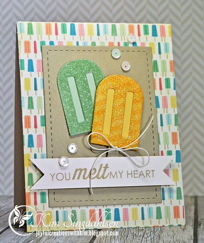
These are really fun new popsicles from Reverse Confetti.  Here's a close-up...

Warm My Heart Close

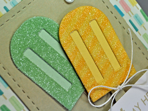
If you look closely at the green popsicle, it has a polka dot background that comes with the Let's Chill stamp set (along with the sentiment).  I added stripes to the yellow popsicle using the So Stripey set.

I used the current Sweet Sunday Sketch.


And now I'm off to find myself a big breakfast!!
  • Stamps: Reverse Confetti Let's Chill, So Stripey
  • Paper: Crate Paper The Pier (FYI - only 1 piece of the popsicle paper comes in the 6x6 pad, so I've already ordered more of this charming pattern here), Simon Says Khaki, Stampin' Up Pistachio, Papertrey Harvest Gold and Vintage Cream
  • Ink: Simon Says Stamp Khaki, Stampin' Up Pistachio, Papertrey Harvest Gold, Versamark
  • Accessories: Reverse Confetti Let's Chill Confetti Cuts, Lil' Inkers Stitched Rectangles, square punch (to cut the banner ends), Ellen Hutson Iridescent Vanilla sequins, Hemptique 10-lb white twine

Thursday, May 22, 2014

Floral Sympathy in Coastal Cabana

Is it sad that when I see a CAS floral challenge, I think "sympathy"?  I don't need any sympathy cards right now, but I still picture a single flower, or a single stem, on a pure white background - and it says "sympathy". There are two CAS floral challenges right now that motivated me - CASology and The Paper Players.

I visited a Stampin' Up demo yesterday and got a chance to play with the new Stampin' Up Blendabilities alcohol markers. The markers come in trios which is nice for blending.  They have twelve color trios so far, plus a set of skin tones. They are smooth to work with just like Copics.  To me, the trios seem a little on the dark end.  I only played with the Olive, Razzleberry and Coastal Cabana trio. I really struggled with the Rich Razzleberry trio - I'm not even going to show you that flower because it's so dark it is hard to see the detail.  I didn't even use the darkest Coastal Cabana on my card below, the lightest seemed to match exactly and I wish the trio had that color in the middle with an even lighter option.  It's probably user-error!!  I am wondering if they work slightly differently than Copics.  With Copics, you lay down your layers of colors, then I tend to color over the entire thing again with the lightest color to blend it all together.  That seems to be too much color with these Stampin' Up markers.  I'm sure I'll still end up with most, if not all, of the Blendabilities because I'm nothing if not "matchy-matchy"!

(Be sure to download the new Stampin' Up charts on my sidebar - they include the brand new In Colors and I have added spaces for the Blendabilities colors. You can download the complete chart, or the In-Color Only chart if you have used the charts before and don't want to color everything in again!)

Heartfelt Sympathy


  • Stamps: Stampin' Up 
  • Paper: Stampin' Up Coastal Cabana, black and white
  • Ink: Memento Black, Stampin' Up Blendabilities lightest Olive, two lightest Coastal Cabana, Daffodil Delight
  • Accessories: Stampin' Up Mustard button (old), Fancy Fan Embossing Folder, Hearts a Flutter die

Wednesday, May 21, 2014

Curtain Call Inspiration Challenge: Pajama Party

Just a reminder - there's a few more days to play along with the Pajama Party challenge at the Curtain Call Inspiration Challenge!


The design team got to work with products from The Cat's Pajamas.  You don't have to use their products to play along, but there is a $25 gift code available to the LEAD of the challenge!

I took my Pajama Party outdoors!  When I was growing up we had a clothesline in the backyard that was shaped like a giant square umbrella.  I have so many fond memories of draping it with old sheets and blankets, hauling out a lifetime supply of snack food, and giggling through the night with girlfriends!

Friends Forever

The "pajama" challenge is open until May 25th at 8 a.m. CST.  There is so much to be inspired by in the photo - popcorn, banners, chevrons or leopard print - just have FUN and play along!
  • Stamps: The Cat's Pajamas Under the Stars
  • Paper: Stampin' Up Pacific Point CS and dsp, Simple Stories Snap Color Vibe (red stripe)
  • Ink: Memento Black, Copics, Versamark (to glitter the stars)
  • Accessories: The Cat's Pajamas 3x3 Stars die, MFT Grout Gray button, Hemptique 10-lb red twine, Stampin' Up Heat & Stick powder, Martha Stewart Fine Crystal Glitter, Pretty Pink Posh 4 mm clear sequins

Monday, May 19, 2014

Stampin' Up In Color Copic Chart 2014-16

I got a chance to snag some small samples of the new Stampin' Up 2014-2016 In Colors so the first thing that I did was update the Copic charts on my sidebar!!!

I tried to make it easier for those of you who have taken the time to color in last year's color chart and I added a new document that is the same In Color page from last year with the new In Colors added.  You can download that one page and be up-to-date.  Here's a link - or get it through my sidebar at any time.


However, it might be a good year to download the entire document because I left spaces for you to add Stampin' Up Blendabilities as you get them.  (Have you heard? Stampin' Up is adding their own line of alcohol markers! They only started out with 12 Stampin' Up colors, but the great part is that each color set actually comes with a trio of colors so that you can blend just like Copics!  They also have a set of six skin tone colors.  I played with them briefly while visiting with a Stampin' Up demonstrator.  I only had a few minutes to play with one of the color sets - so I'm not making any judgments at this point - but I do love matchy-matchy things!)  Here's a link to the entire chart, or it's on my sidebar at any time.


The new In Colors are deep and rich - and I need to build up a stash of sympathy cards - so I have used some of my new Copic matches to create this card.  NOTE: The purple is misleading.  The In Color is a deep blackberry - the matching Copic is on the outside of the butterfly.  The next lighter Copic for blending is quite a bit lighter so the butterfly is not representative of the deep purple color.

So Sorry

My card uses the current sketch at CAS(E) this Sketch.


  • Stamps: Stampin' Up Papillon Potpourri, Growing Green (the branch) and So Sorry
  • Paper: Stampin' Up Mossy Meadow, black
  • Ink: Memento Black, Copics and Stampin' Up Mossy Meadow
  • Accessories: Stampin' Up butterfly punches, clear sequins


Thursday, May 15, 2014

Curtain Call Inspiration Challenge: Pajama Party

It's time for a new challenge at the Curtain Call Inspiration Challenge and we are having a Pajama Party!!


The pajama party is due to our fabulous new sponsor, The Cat's Pajamas. The Curtain Call design team is all playing with TCP products and the LEAD of our challenge will receive a gift certificate to The Cat's Pajamas.  Remember, you don't have to use their product to play along - just be inspired by the photo!


I used this charming little scene with a Daddy Bear and a Baby Bear called Quality Time.  It comes with lots of sweet sentiments - and could be perfect for Father's Day.

Books and Dreams

Also on this card are one of the dies from the Toppers CutUps which is a series of dies that can be used as the top of tags.  I just used a strip of it here, but you can cut the tag any size that you would like.  I also used the 3x3 Stars which come with solid stars and outline stars.

The layout is from the Sweet Sunday Sketch Challenge.


Be sure to check out all of the other design team cards for the pajama party with The Cat's Pajamas! 

Pajama Party Designers


The Cat's Pajamas Designer, Noelle McAdams

  • Stamps: The Cat's Pajamas Quality Time
  • Paper: Stampin' Up Pacific Point and Real Red, Simon Says Stamp For and Slate
  • Ink: Memento Black, Copics, Versamark
  • Accessories: The Cat's Pajamas Toppers CutUps die, 3x3 Star dies, Hero Arts white embossing powder, Hemptique 10-lb white twine, Martha Stewart Fine Crystal Glitter

Tuesday, May 13, 2014

Catered Crop: Sweet Home

There's a new challenge up at Catered Crop - Sweet Home.  Linda describes the challenge as follows:

Our challenge for the next couple of weeks is about house and home. Include a house of any kind (dog house, bird, house, trailer). This is a great opportunity to create a card “from our house to yours,” welcome someone into their new home, announce your move, or thank a host. OR – in honor of our remodeling project – create a project about the things you do to make your house a home – like gardening and home improvements.

There's a lot of room to play with this challenge. For me, it came at a perfect time because I need a new home card.  I don't seem to need new home cards very often. I've been in my home for 24 years and my friends seem blessed to be just as settled. I do have long-time church friends finishing up an extensive remodeling project on their retirement home on a lake in the Carolinas.  Next week is a going away lunch, so I created a little birdhouse card for them using some of my favorite dies.

So Happy For You

The bird, birdhouse and leaf sprig are a die set from WPlus9 called Folk Art Florals - I love all of the details.  The background layers come from a new-to-me set from Mama Elephant called Femme Frames - I love the sweet layers and this will likely become a classic for me too.

I only have one inside sentiment that I use for new home cards - it's from Impression Obsession.

From the moment
you move
then ever after,
May your new home
be filled with
love and laughter.

The other reason that a sweet home challenge was appropriate for me was that I spent six hours on Mother's Day organizing my craft corner and it is sweet!!  Yes, I still have 1970s wood paneling in my family room. I have spent years apologizing for it, but the simple fact is - I like the warm feeling of it! I would like to replace the big, ugly, ancient table, but every time I bring it up, my husband quite accurately points out that it is usually completely covered and no one can see how ugly it is anyway!

001 ed

This may not look like much, but when you only have a corner, efficiency is the key.  See the door to the right?  That goes to the laundry room/bathroom, but there's also a large closet that is full of supplies too.  The key is to keep the things out that I use often, and tuck away those things that I don't. That's what took six hours.

The floor under my desk and the table had become totally cluttered with boxes of sequins, and stencil supplies, and a big crate of 6x6 paper pads.  Since I use those often, they got permanent homes, while things like rhinestones and stickles and brads got relegated to the closet (or tossed)  I still haven't figured out what to do with those three ring binders which hold my dies, so for now, they are still on the floor.

002 ed

From left to right...
To the far left of the above picture is a set of Elfa drawers that hold, from top to bottom, buttons, basic supplies, twine, PTI patterned paper, and a drawer of all the miscellaneous embellishments that I couldn't stand to get rid of.  None of these are my most-used stuff, because it's a little awkward to get to with that over-size TV tray in the way.  I actually make my cards on that tray because it faces the television.  On top is my photo station - a little handmade light box.

005 ed

On my desk is all of my cardstock.  Stampin' Up and PTI is in rainbow right in front of me. To the left and below the cardstock are boxes of inks - I keep them in clear shoe drawers from the Container Store. The light is an Ott light - it faces away like that when I am taking pictures or I just swing it around for my light on my project.  My favorite part of the whole clean-up is that little vanity tray in front of the light.  I am so tired of losing stuff in the piles of supplies that I pull out for each card (I'm a trial-and-error gal so about a dozen different colors, dies, stamps, buttons, twines, etc come out for each card!) - then things get lost in the pile, especially dies and small clear stamps.  So...into the tray these small things go - simple solution to a big problem!  My paper is in Project-View Folders which are open on two sides so easy to store and use paper and scraps.

007 ed

On the right side of the desk are these cubes from Michaels. They used to hold all of the retired Stampin' Up cardstock - and I mean all of it.  Can you say Mint Melody and Mauve Mist? But keeping it there left me no room for My Favorite Things and Simon Says cardstock - so except for a few of my favorites, the retired Stampin' Up is now under my desk in a rolling bin.  On top of the cubes are the sequins and stencils that had been on the floor.

003 ed

I do maintain four entire sets of cardstock (and there are others that I want but even my obsessiveness has limits!)  To keep track of the colors, I keep swatch rings.  These come in really handy in this small space because I don't have to get out full packages of cardstock when I am trying to match.

011 ed

Next is a small set of Elfa drawers that hold Cuttlebug folders and big dies.  On top is my Copic collection in a Quickutz storage system that, sadly, isn't made anymore.

009 ed

My craft corner is like a little world of its own.  If I swing all the way around so I am facing away from my desk, there is another set of drawers. There is just enough room between my desk and the drawers for a  "hallway" to the bathroom, so it's easy to swing around in my desk chair and grab what I need.  On top are ribbons and my Big Shot. The drawers hold my stamps sorted by theme and/or company, and a few punches that I use often.  One of the big things that I did is pull out all of the wood stamps (except for Stampin' Up). I just don't use them.  I am following a principle stated by Susan on her Simplicity blog - pack it away and if you haven't thought about it six months later, it's probably time to get rid of it.

004 ed

I am not  going to show you the closet in the laundry room.  It got cleaned up and sorted just like my craft corner, but even I am a little overwhelmed by all of the stuff that I have!

I love my craft corner!
  • Stamps: WPlus9 Strictly Sentiments 2
  • Paper: Simon Says Stamp Khaki, My Favorite Things Berrylicious and Sour Apple, Stampin' Up Crisp Cantaloupe CS and dsp
  • Ink: Papertrey Ink Classic Kraft
  • Accessories: WPlus9 Folk Art Florals die, Mama Elephant Femme Frame die

Thursday, May 8, 2014

Sent with Love on Mother's Day

I am totally in love with the new grays at Simon Says Stamp.  They have a warmer look to them that makes them a lovely backdrop to almost any color.  I added just a hint of color and I love the way it stands out on the gray.

Sent with Love

I just got the variety cardstock pack of their newest Daybreak colors which included three different grays, the lavender on the flower and three other colors.  I'm already out of the two lighter grays and, wouldn't you know it, Simon Says is currently sold out of them.
  • Stamps: Simon Says Stamp Square Sayings (sentiment), Tag Sayings (tag), Flower Friend (flower and leaves)
  • Paper: Simon Says Stamp Fog, Smoke, Lavender and Green Apple
  • Ink: Versamark
  • Accessories: Wow White Embossing Powder, Mama Elephant Femme Frames, Simon Says Flower Friend and Medium Tag dies, My Favorite Things Grout Gray button, Hemptique 10-lb white twine, Simon Says Orchid sequins

Wednesday, May 7, 2014

Curtain Call Reminder: Hi!

Just a reminder that there is still time to play along with the Pink & Pretty challenge at the Curtain Call Inspiration Challenge.


The sponsor for this challenge is Pretty Pink Posh.

I kept it very simple. I love the bokeh look of random circles and it's even better with a few sequins!  (If you saw my card from yesterday, you could tell them that I made them at the same time. Although very different looks, they both have a little grouping in the bottom right corner.)

Hi From Me to You

I really like the flat sequins at Pretty Pink Posh - these are Pink Blush.  Most of the colors come in flat or the traditional cupped sequin.  They have also just added smaller sequins in each color - these are the 4mm sparkling clear.

You have until 8 a.m. CST on May 10th to play along and there is a Pretty Pink Posh gift certificate up for grabs to the winner!  Hope to see your Pink & Pretty creations.
  • Stamps: Technique Tuesday Rah Rah Sentiments, Simon Says Lots of Dots
  • Paper: Simon Says Stamp Cotton Candy, Smoke
  • Ink: Simon Says Stamp Cotton Candy, Smoke
  • Accessories: Pretty Pink Posh Flat Pink Blush sequins and 4 mm Sparkling Clear Sequins