
The challenge at The Color Throwdown came at an opportune time - my husband had just asked me to make a sympathy card. It was a bit easier to make than the usual sympathy card because I did not know the person and my husband hadn't seen him decades. But he was very important to my husband in his youth so he wanted to make sure the family knew that he remembered and he cared.
I already knew I was going to use this soft flower and then I was drawn to The Color Throwdown colors of light blue, gray and kraft for the very odd reason that it's a real struggle for me to do leaves that aren't green! This color scheme forced me into a gray or a kraft. (I guess I could have done gray flowers and blue leaves but that's really pushing it for me!!)
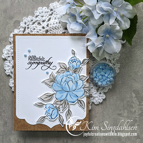
This is another flower set that uses stencils to add the color. With my new-found passions for stencils it definitely found a home in my stash!! This is my most-used sympathy sentiment - it has such fabulous fonts and style - but it's from the now-closed Verve. I found the background paper in my older stash. It's a Stampin' Up dsp that's all kraft/brown with subtle shiny patterns. I think it was for a technique but I just wanted the elegant pattern.

Thank you to The Color Throwdown for the inspiration!
SUPPLY LIST
Stamps: Pinkfresh Studio Choose Hope, Verve New Mercies (the company is no longer)
Dies: Pinkfresh Studio Choose Hope die and Ornate Banner
Cardstock: Stampin' Up
Ink: Blues from the Altenew Lapis Lazuli set, Grays are Simon Says Fog and Stone
Other: Studio Katia Bluebell Pearls
This is so pretty, Kim! I'm right there with you on the non-green leaves. Narelle is so good at that. I love what you've done with them here!
ReplyDeleteBeautiful card, Kim! I like the soft blue flowers and the embossed images in the background add just the right amount of interest without being distracting to the focal image!
ReplyDeleteKim, it's a wonderful way for your husband to send his condolences to that friend's family.
ReplyDeleteReally beautiful - and I happen to adore the grey leaves! Surprised? lol
=]
This is a lovely sympathy card, Kim. You've nailed the Color Throwdown palette perfectly. The gray leaves look wonderful against your blue blooms. Awesome base, too. I've had to make a few more than normal sympathy cards this past year, and it never gets easier. Yours is wonderful. Stay safe. xo Bev
ReplyDeleteSo lovely and elegant; I want to say soothing, too. That Pinkfresh Ornate Banner is an especially nice element, but doesn't overwhelm your overall design. I always admire your work.
ReplyDeleteThis is such a beautiful sympathy card, Kim! I love your gray leaves!
ReplyDeleteThanks so much for joining us at the Color Throwdown this week!