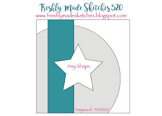
Although I don't use stencils very often, I have an overly-large stash. Obviously I plan on using them and I like the results, but when the chips are down I like nice, clean (literally) diecuts. I don't end up with the colorful fingers I often get when I stencil. BUT I knew I had a large heart-shaped stencil in my stash so if there was ever a time when a stencil got used, this sketch was it!
I didn't want to cover all of the stenciled background so I started with the sparkly see-through ribbon. It wasn't quite wide enough and didn't look balanced so I added a couple of other strips. Then I added a fun "love" die that I recently purchased and I tucked a little black sentiment into it.
All of the pinks are a better match than what the photos show. My natural light in the winter is very blue so I always have to edit it to get rid of some of the blue. But in this case, editing it changed the pinks. So I went halfway and now I'm not happy with any of it - the photos has a blue cast and the pinks don't match! I'm so not an expert at this. I probably should learn more about it - but I'd rather spend my time making the cards!!
I hope to see you playing along with us at Freshly Made Sketches.
SUPPLY LIST
Stamps: Impress Rubber Stamps Valentine Word Set
Dies: PhotoPlay Say It With Stamps Love and Sentiment Strips
Other: Picket Fence Studios Heart of Flowers stencil, Trinity Stamps Black Heart Jelly Drops, Stampin' Up Tasteful Textiles embossing folder


I love that gorgeous, soft background on this gorgeous card! This stencil is perfect for the sketch. And I feel your pain in getting the colors just right in photo editing. If you figure it out, let me know!
ReplyDeleteOh my that background stencil worked out perfectly! very pretty card!
ReplyDeleteKim, all the colors look very pretty from where I'm sitting! Yes, I agree it was the perfect opportunity for that pretty stencil and a darling idea to use that sparkly ribbon as one of your stripes.
ReplyDelete=]
ps can you adjust the white balance on your camera? Often that's easier than trying to do it while editing.
Lighting can be so infuriating when it doesn't look like you see it! I totally get that! I love your stenciled background!
ReplyDeleteI absolutely love this Kim - what a fabulous stencil! You totally inspired me this week, although not for my FMS entry, which turned out quite different. I just love the soft background and bold ‘love’ diecut - I am definitely going to hunt through my supplies to create something with these ideas this week!
ReplyDeleteThis card is so pretty Kim! I just love that stencilled heart! It's so perfect for this card! Just screams love!!!
ReplyDeleteThis stencil looks like it was made for this sketch! Such a gorgeous card!
ReplyDelete