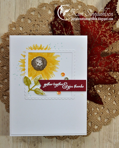
I was inspired in many ways by their graphic. Clearly - the sunflower. But I added a sprinkling of blue for the sky and a piece of "barnwood" for the sentiment. My card isn't exactly Card Concept's definition of "Clean and Simple" since it does have more than one main image and it's not particularly easy to recreate. So I'm going to call it "Clean and Layered". If I had to design my comfort zone for styles, it's definitely "Clean and Layered"!
Isn't that just a fabulous graphic? I want to enlarge it, frame it and hang it on my wall!!
SUPPLY LIST
Stamps: Stampin' Up Painted Harvest, Artisan Textures, Woodgrain, Versamark
Cardstock: SU Cherry Cobbler
Ink: SU Daffodil Delight, Crushed Curry, Soft Suede, Old Olive, Pool Party
Dies and Punches: SU Layering Squares Framelits Dies, SU Leaf Punch
Miscellaneous: SU Iridescent Sequin Assortment


very nice.
ReplyDeleteThis is just gorgeous,love the sunflower.xxx
ReplyDeleteBeautifully done Kim!
ReplyDeleteVery pretty. I love how you've offset the frame!
ReplyDeleteWow! Love the frame, the layout, the pop of red - very pretty! Thanks so much for joining us at The Card Concept.
ReplyDelete