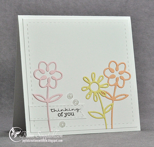
True confession time. I am not overly comfortable with pastels. It's a little bit like patterned paper. Some of my favorite cardmakers layer lots and lots of patterns on each card - and I LOVE it. If I used exactly the same papers and exactly the same stamps and made exactly the same card - I guarantee it would look cluttered and I'd hate it. Ditto for pastels. I see such lovely cards, but everything that I make seems dull and flat. I don't wear pastels either, nor do I have pastel home decor. Isn't it funny how we each have hard-coded likes/dislikes and they impact us so greatly? (Or am I the only crazy one here?!)
I had a lot of false starts on this one. I tried a baby card with a shaker, I tried a row of elephants (don't ask!), I tried layering butterflies. I ended up with an embarrassingly simply card (except for adhering the flowers) and I actually really like it. I think it sends a sweet and thoughtful message - I'd actually pull out these colors again!


I think you did a fabulous job with these pastel colors. Your card is so striking, even though the colors are soft. The open die-cuts are such a great look.
ReplyDeleteYour card is absolutely gorgeous. Those flowers are perfect with these colors. No one would know the struggles you had with them. Thanks so much for sharing with us.
ReplyDeleteSimple but BEAUTIFUL!
ReplyDeleteSweet and delicate!
ReplyDeleteWOW!! I LOVE the simplicity of this card. The white space really draws the eye into the flowers!! Great design!
ReplyDelete