I spent some time wishing I had that living room. Wouldn't it just make you smile to sit in that room every day?! My house is a little on the bland side - I'm just not brave enough to put together all of those colors and patterns and have any confidence that it would look right in the end. Besides, I can play with colors at my craft table and if I hate it, the most that I waste is a bit of cardstock!
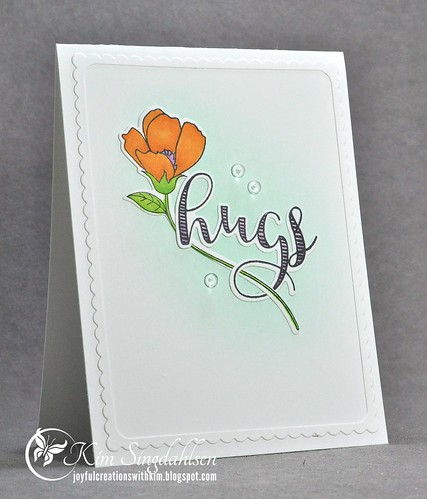
I went to my not-yet-used stash of stamps thinking I'd go bright and graphic - just like the photo. But right away I saw some stamps that I just had to have a few months ago and I haven't used them. It's two different sets from the same company - I love how the flowers and sentiments can be intertwined. I put the aqua in the background, colored an orange flower and added an orchid-colored hug!

If for any reason, you are not familiar with the color throwdown and the amazing design team, run right over and check them out. There's not a week that I don't carefully study their cards and get all kinds of ideas and inspiration!
SUPPLY LIST


Beautiful card, Kim! The stem going through the sentiment is a great look.
ReplyDeleteYour card is lovely! I like the soft
ReplyDeletebackground. I have wanted the
Just Because set from MCT, but have
resisted. Maybe I do need it!
I love this! and THANK-YOU for joining us despite the mix up earlier this week. your card is soooo soft and pretty. I love that image.
ReplyDeleteStunning CAS design (you are a master at creating clean, less is more style cards)! Thrilled to have you guesting with us...and sorry the glitches caused a delay.
ReplyDeleteI love every little thing about this card!!
ReplyDeleteWhat a fabulous use of the colors, Kim! LOVE the intertwined flower stem and sentiment! I'm so glad you're joining us!!
ReplyDeleteLOVE this CAS take on the colors, Kim! I'm so glad you're joining us!
ReplyDelete