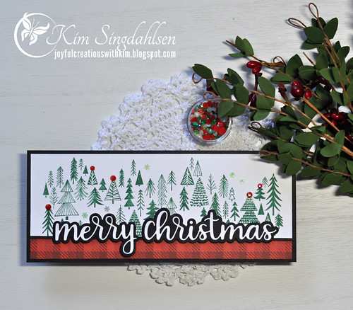
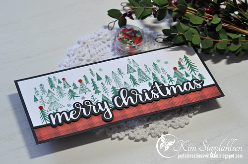
I love the current graphic at The Card Concept. It's such a classic Christmas look! I thought about pulling out a chair die and using the inspiration quite literally by creating that charming scene, but I have so many unused Christmas stamps and dies so I went in a different direction.
I was inspired by the plaid in the photo and the fresh white and green. I also saw my layout in their photo with the plaid at the bottom and the white/green at the top.
The stamp is a new stamp in Impression Obsession's slimline series. The stamp covers an entire slimlime and has a wonderful curved and graceful look which you can't see well on mine with the big sentiment. The die is from Trinity Stamps; I love the font and how it pops with the backer die.
After I stamped the trees, I stamped again with the tops of the trees colored with a Versamark pen. Then I embossed some heat and stick powder and added glitter. I had some snowflakes that matched perfectly then added red tree topper gems to a few of the trees.
I've always liked The Card Concept's style definition of Clean and Layered. I never felt I was a Clean and Simple creator mostly because I don't find any card "simple"! But I definitely like clean so since I first saw their definition I have called my style "clean and layered".
Thanks so much to The Card Concept for the inspiration.
SUPPLY LIST
Stamps: Impression Obsession Sketched Trees
Dies: Trinity Stamps Scripty Christmas
Paper: Moda Scrap Sudtirol Origins 12x12
Ink: Stampin' Up Just Jade
Other: Pretty Pink Posh Holiday Mix gems, Stampin' Up Adhesive-Backed Snowflakes


What a fun take on the challenge, those trees are cute!
ReplyDeleteWhat a gorgeous slimline card! Love your Clean and Layered design- just perfect for our inspiration challenge! Thanks for sharing with us at The Card Concept and we hope you can play along with us again soon:-)
ReplyDelete