Tuesday, July 3, 2018

Taylored Expressions: Big Butterfly in Watercolor

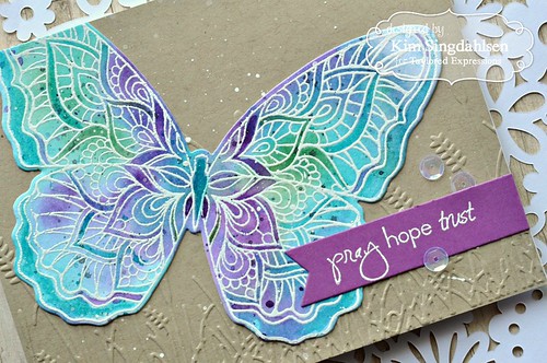
Taylored Expressions has recently released a line of liquid watercolors.  I am late to the watercoloring trend although I love what I see from everybody else.  I'm fairly certain it's because watercoloring involves letting go of control and that is way outside my comfort zone.  I had a wonderfully free weekend and a craft room just calling my name so I decided I needed to get comfortable with watercolors.  I want to be able to create soft backgrounds or vibrant backgrounds; I want to be able to create the stunning dimension that you can get with layers; and I want the realistic look of coloring images with it.  Now I'm not going to say one weekend made me proficient - far from it - but I'm more comfortable.

I did it with the help of the Liquid Watercolor posts on the Taylored Expressions blog - starting here.  Day 1 starts with Color Mixing and Painting.  Then if you click to Day 2, it's Color Wash and Shimmer Liquid. Day 3 is Detail Painting. Day 4 is Smooshing and Day 5 is Painted Plaid.

I worked through all of those days and have a lot of cards for my personal stash, but not quite good enough to share here.  However, you have to check out Day 4 Smooshing.  First of all, it's the most beautiful card that I've ever seen.  Secondly, Gayatri has done a fabulous video that walks you through each step and at the level that I need.  For instance, you can see exactly how much liquid watercolor to put down to smoosh with, how different water misters acts, how to build up dimension (both in smooshing and then she adds detailed color later), how to splatter it and more.

I went through the video step by step, pausing it and replaying it repeatedly while I worked on my own card.  Not in a million years do I have the skills set to replicate exactly what she did - but I'm happy with my card.  And more importantly, I'd actually do it again!
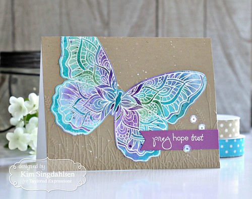
Taylored Expressions Big Butterfly 

I do need to continue practicing.  I didn't get the layers of watercolor - mine almost looks more like a wash than a smoosh. (And that's an odd sentence to type!)  I did go back and add depth to portions of it by painting directly as Gayatri did on hers.  I also splattered like she did but for my white I used white acrylic paint, slightly watered down. (The Oreo Liquid Watercolor is fabulous for black speckles.)

Taylored Expressions Big Butterfly Flat 

What I learned this weekend is that while I cannot claim to be a skilled artist, there are tools and lessons and products available to help.  By the time I was done with this butterfly, I truly felt like I would do it again.  I don't think there's any simpler way to get that vibrant color than literally some drops of watercolor, misted with water and smooshing paper on it.  It's quite amazing how it works.

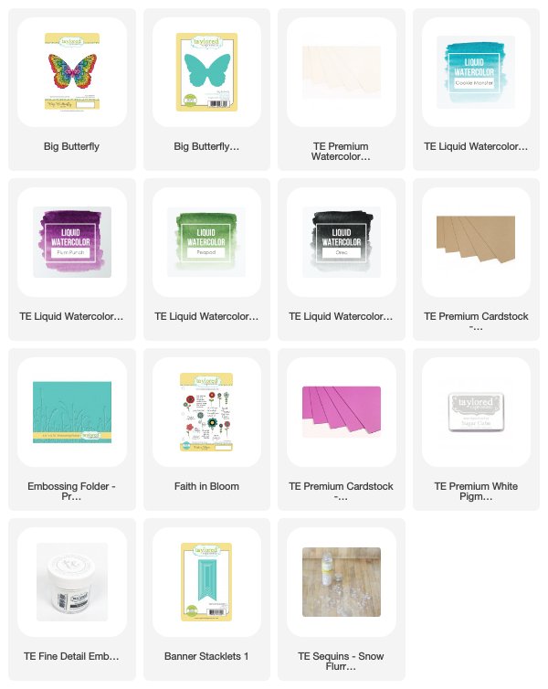
SUPPLY LIST

Monday, July 2, 2018

CAS(E) this Sketch! Good Times

I recently updated my Copic match chart for all the new Stampin' Up colors (see just to the right on the sidebar) but I hadn't had a chance to use it.  I spent this weekend organizing my new craft room.  I'm loving it - but I actually think I have less space than I had in the old house.  Of course, in the old house, it involved a corner in the family room, a large closet in the utility room and an overflow closet under the stairs in the basement.  So no complaints - I now have one room that's bright and cheerful and I am surrounded by the hobby that I love.

However, I had to made some difficult decisions because some of the storage is in a tall built-in and the top two shelves involve using a step-ladder.  One of the things I decided could go way at the top were old stamp sets.  I have Stampin' Up product going back to the 90s.  (Who remembers Mint Melody and Mauve Mist?!)  I am emotionally attached those stamps and colors - it's how I started.  But I haven't touched them in literally decades. I was brutal with my Stampin' Up stash.  I just can't get rid of it but I did put all but the most current productsway up high. (I kept my step ladder is just behind the door for easy access!)

I've used a flower on the next card that went up high.  It's not that old, but it is retired.  I'm already having regrets about packing it away - but then I'd prefer none of it got packed away. 

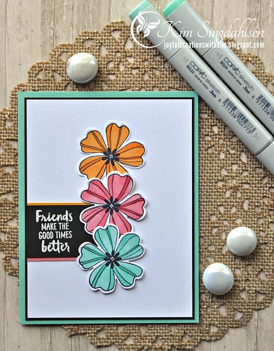
CtS Friends

The sentiment is from the current Waterfront set - it has a coordinating inside sentiment that says "...& the hard times easier".

The lighter colors on each flower are the colors from the Copic chart for Mango Melody, Flirty Flamingo and Coastal Cabana.  The darker colors for shading are the next Copic up except for Mango which doesn't have darker shade so I used YR04.  

The current sketch from CAS(E) this Sketch inspired this entire card.  It's what sent me looking for a trio of flowers to color!  I love the way the sentiment is offset.


SUPPLY LIST
Stamps: Stampin' Up (SU) Flower Shop, Waterfront (sentiment)
Punch: SU Pansy Punch
Cardstock: SU Mango Melody, Flirty Flamingo, Coastal Cabana
Copics: Y38, YR04, R22, R24, BG32, BG34
Miscellaneous: small drops of Nuvo White Blizzard Drops in the center of each flower.

Sunday, July 1, 2018

Merry Monday Christmas Challenge

My last post told you how giddy I was to actually be making cards for fun again.  After I finished the card on that post, I was browsing challenges to see what else I could make.  I got to the Merry Monday Christmas Challenge and stopped in my tracks - did you know they are closing down??  Oh no!  I'm so sorry I didn't play the first half of the year. (Life was busy!)


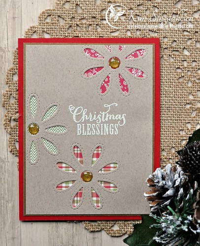
Their theme for their last challenge is "rustic".  Sadly, my Christmas stamps suffered in my recent move to a new house - they were dropped and scattered all over the driveway.  My clueless husband actually had the nerve to say that it wasn't a big deal since I didn't need them until December.  Seriously??!!  I should have started Christmas cards last December 26th.  I just haven't had the energy to try to put them all back together.  So I looked at the Frantic Stamper Stitched Daisy Pair die I had out for my last post and even though daisies don't scream Christmas, I decided I could change up the colors and make it "rustic" and hopefully even Christmasy!

MM Christmas Blessings

At the top of the heap of Christmas stamps was a set from Verve.  It seemed appropriate to use something from Verve given that's the end of an era also.  Some of my earliest stamps are from Verve and definitely the main portion of my Christian stash is Verve.  I will miss them also.

Perhaps this was cheating - it's exactly the same card as yesterday with different colors.  But I like it.  In fact I like it so much, I went for #3...

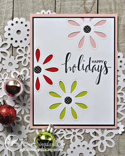
Holiday Daisies

This was one is more contemporary so I found an older sentiment from My Favorite Things to match the look. 

And now I have two Christmas cards done.  I have a long way to go but I had fun getting started!

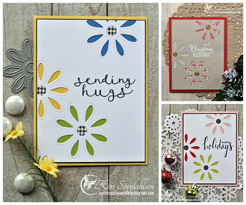
Here's the trio of cards - yesterday's (non-Christmas) and the two from today.

Daisy Trio

Farewell Verve.

Farewell Merry Monday.

I will miss you both.

SUPPLY LIST

Die: Frantic Stamper Stitched Daisy Pair

RUSTIC CARD:
Stamp: Verve Weary World
Cardstock: Neenah Desert Storm
Patterned Paper: Echo Park Christmas This & That
Ink: Versamark and Antique Ivory Embossing Powder
Miscellaneous: Doodlebug Gold Sprinkles

SWEET CARD:
Stamp: My Favorite Things Hand-Lettered Holiday
Cardstock: My Favorite Things Tickled Pink, Red Hot, Limelight
Patterned Paper: Bazzill Basics Licorice 6x6 pad

Color Throwdown: Sending Hugs

I can't tell you how long it's been since I made a card just for fun.  Actually I can - probably since January when we decided to move after 27 years in the same house.  It's been a blur since then - trying to get our old and very lived-in house "freshened up", figuring out what and where we wanted to live, buying a house, moving, decorating, organizing my brand new craft room(!) - and in the middle of it all my youngest son graduated from high school.  It's all been wonderful, but not so much for making cards.  Don't get me wrong.  I do have various card commitments which forced me to take time to craft (thank goodness for those commitments - the time at the craft table kept me sane.)

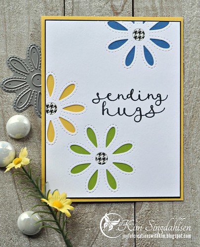
Over the past few weeks, I've started to realize that life was settling down.  I also realized that it had been awhile since I had shopped.  So I sat down and made a dent on my wishlist.  I'm using two new-to-me items although probably not new to most people - the flower die has been on my wishlist for around two years!!  The sentiment is quite new though.

CTD Sending Hugs

As much as I love that die and the sentiment, I probably wouldn't have sat down to make this card without the inspiration from Color Throwdown.  I absolutely fell in love with the inspiration photo.  I'm not sure I would have added the bright blue with their inspiration but I think it's lovely!


This was fun!!  And I made it and am writing this yesterday morning and have an entire day in front of me to craft. Yay for our hobby!

SUPPLY LIST

Stamps: Neat & Tangled No Words
Dies: Frantic Stamper Stitched Daisy Pair
Cardstock: Stampin' Up Daffodil Delight and Granny Apple Green, My Favorite Things Cornflower
Patterned Paper: Bazzill Basics 6x6 Licorice Pad

Wednesday, June 27, 2018

Freshly Made Sketches: Sending Get Well Wishes

It's time for a new sketch at Freshly Made Sketches! Today we have a sketch by Jennifer Timko.


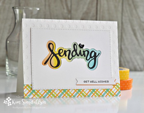
I am a fan of big sentiments, particularly in a variety of fonts.  As soon as I saw this sketch, I could see that it would be just right for a sentiment plus a splash of color in the bottom strip for interest.

FMS Sending

I had liquid watercolors out on my desk for a different card and I decided a rainbow of color behind a cut-out sentiment would be nice.  I painted the background to the sentiment, then cleaned up all of my watercolor supplies before it occurred to me that it would have been really nice to have a coordinating watercolor strip across the bottom.  It was a tough choice - get everything back out, use it and clean it up again - or find a plan B.  As luck would have it - I have a piece of paper that is exactly the same colors as the background that I watercolored!  Plan B won.

I hope to see you playing along!!

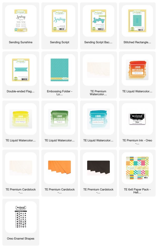
SUPPLY LIST

Wednesday, June 20, 2018

Freshly Made Sketches: Turnip the Beet

It's time for a new sketch at Freshly Made Sketches! Today we have a sketch by Amy.


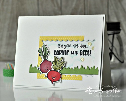
I love this sketch because I love detailed little scenes and this sketch has all of the detail in one area!  I have had a stamp set on my desk that seemed just right for this.  I immediately saw the long strip as grass and then decided some root vegetables(!!) would be just right under the ground.

FMS Turnip the Beet

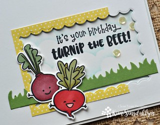
I added some stenciled clouds in the background and some sunny yellow polka dots.  Then I added the inside scallops to keep it sweet and fresh.  

I love these little guys but I did sort of mess up the turnip by coloring him like a radish (and who would have thought I would ever be typing that sentence!)  The set is going to stay on my desk until I use the carrot with "you're old...but I don't carrot all" and the mushroom with "oh shiitake you're old"!!  

FMS Turnip the Beet Close

You might notice some blue cardstock in the supply list but neither of these photos really show it.  I wanted the top layer to stand up a bit but instead of layering with foam tape or another layer of white cardstock, I added a layer of blue.  On the actual card, it accents the clouds in the sky!

I hope you play along with us this week and I definitely hope you have as much fun with it as I did!!

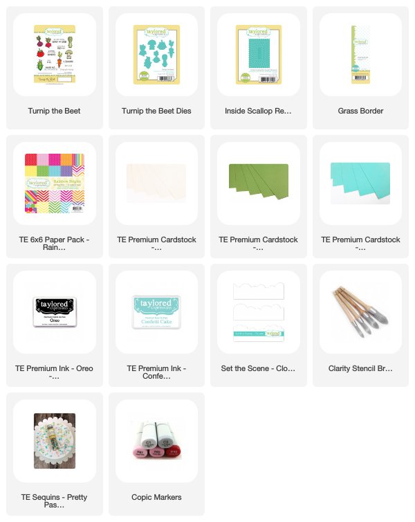
SUPPLY LIST


Monday, June 18, 2018

New Copic Color Charts for Stampin' Up 2018

I finally got my Stampin' Up order with all of the new colors!!  What an amazing rainbow of fun.  I am a color fanatic and I love every year when they give us five new in-colors.  But this year, Stampin' Up released 5 in-colors, 10 new core colors and 6 colors returned to the line-up!

Before I continue, let me be sure to say that I am in no way affiliated with Stampin' Up.  Every thing in this post is for my personal use that I also choose to share with you.  Please read the footnotes on the chart for further disclaimers.


Click on the photo above or the link on my sidebar to download a complete list of all current and retired Stampin' Up colors with my choice for the matching Copic markers.

NOTE: Besides the new additions, I changed my Copic choices for two colors from previous years.  It's not that the old choices were bad, but sometimes when new colors come out, they change my perspective on other colors.  These colors are Sahara Sand and Calypso Coral.

I was asked recently if the charts were necessary.  Personally, I like quick and easy charts.  Let's say I pull out some Granny Apple Green cardstock and a leaf to color - I can glance at my Copic Color Match charts and reach right for Copic Marker YG03 and I'm ready to go!!  I do admire an artist who can simply visual a color and grab the right one - but that's not me.  I go to my reference.