
Be sure to check out all of the other designers starting on the Taylored Expressions blog because there is just too much for one designer to show off in just a few days. All the products that I have used are linked at the bottom, but remember that new products aren't available until Thursday, August 4th, 7 a.m. PST.

Taylored Expressions is celebrating Release Week with some fabulous giveaways! Visit the TE blog to answer Taylor's Question of the Day for a chance to win a prize from the latest release.
The stripes of the new Diagonal Stripes Cutting Plate reminded me of beach scenes where the water gets darker and darker, then clouds, then a light sky. Clearly, beach scenes are not normally diagonal but that's the fun of it!

I pulled out my favorite shades of beachy blue, some sand colors, a soft yellow sun and a lot of fresh white!
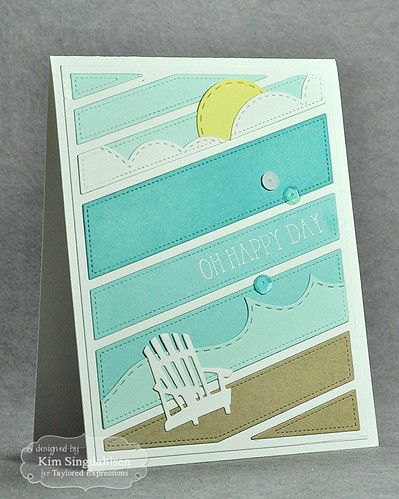
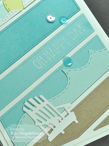
Here's what's fun about this card. I only have two different blue cardstocks on it - Salt Water Taffy and Sprinkles. The secret to the darker third color...Versamark ink! It's been years since I have used it for anything other than a base for embossing powder, but in this case, I rubbed it on the stripe just below the clouds and got a darker blue that totally coordinates with Sprinkles. That stripe and the two below it are all Sprinkles cardstock! I can't believe that I had forgotten about it for this long because it's the perfect way to solve the problem of needing a darker coordinating color.
I had originally thought about adding white sequins as the foam between the water and the beach, but before I started, I realized that sequins on the diagonal will all run to the downhill side and I wouldn't get a nice line of foam. Luckily, Taylored Expressions has a great set of wave dies. A little Adirondack chair and it's a peaceful beach.
Then I decided to go absolutely crazy! Plus it occurred to me that a good white ink would allow me to lighten colors and guess what Taylored Expressions is releasing this month - white ink!!
I did this cheerful "Just Because" card, then I wrote up a little tutorial. ("Tutorial" might be a bit of a grandiose word for my instructions which basically just say "rub with ink"!!)
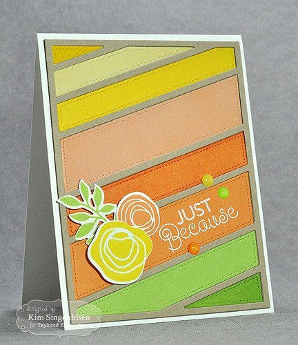
I started with the idea of some floral colors on toffee. I laid out my colors and my flowers.

It could be nice this way but I decided to lighten a few stripes with
white ink and darken a few with Versamark. I have two ways that I like to apply
ink. I have used cotton balls for years. I grip them tightly to give them
a mushroom shape. This avoids the straight edges of sponges which I find
hard to use and get a smooth finish. I'm also in love with stencil brushes.
It takes a little time to brush on the color, but it builds up nicely and
smoothly.

Here you can see the difference as I've applied
Versamark to the right side of the strip.

Then I used the new Taylored Expressions
Sugar Cube ink to apply the white. It has fabulous coverage; in fact,
I applied a little too much to begin with. But I accidentally found a way
to deal with that. I tried wiping with a cloth but it didn't take much
off, but while I was wiping with a cloth, I was holding the stripe like this.
(Clearly when I was brushing on the white ink, I was brushing it on my
finger also!!)

And when I pulled it away, apparently the
oils on my finger lifted some of the white ink! You might have to squint
at this picture to see that the bottom is a bit darker. It's much more
pronounced in real life - and it would have been much better had I taken
the picture to show the difference with the orange stripe!

Just an FYI - you really don't have to
sponge, cotton ball, or brush when you use Versamark - you can just rub it on
the paper and it works just fine. Not so much with the white ink.
You need a tool to get the smooth coverage, but it’s a beautiful soft
look when it’s done.
Remember to check out all of the other designers listed on the TE blog and be sure to answer Taylor's Question of the Day for a chance at prizes!
SUPPLY LIST
Oh Happy Day


Just Because Florals


I just love your beachy scene, Kim! Such a clever use of that diagonal die. And now I'm coveting the waves dies and Adirondack chair :)
ReplyDeleteTerrific cards Kim!! What a great reminder about the Versa Mark!!
ReplyDeleteWow these are fabulous! Adore the beach scene and since I live in the Adirondacks I am thinking I need that Adirondack chair! And I never knew about using Versa Mark like that! Thanks for the tip!
ReplyDeleteYour second card is what cardmaking is all about--designing cards to fit the person you're sending it to! You couldn't have found a more perfect card in a card store.
ReplyDeleteThese are beautiful cards, Kim! The beach scene is colorful and so inviting and I love the way you used the wave and cloud dies! But the warm bouquet of flowers is my fave. Thanks for showing us how you modified the colors. Happy and fun.
ReplyDelete