Tuesday, September 13, 2011

One Layer Wednesday: Baby

The One Layer Wednesday challenge is back after a brief break with the aptly named challenge, "We're back, baby!"  The challenge was to create a one layer baby card.


There is something on this card that I consider absolutely essential for CAS cards - the oval!!  I have a set of small clear ovals by A Muse.  They are perfect for grounding your image, particularly when you are just plopping the image in the middle of white space.  You can put them under vases of flowers or pumpkins or Christmas trees...or...giraffes!!  I stamped the giraffe, masked his feet, inked the oval, stamped it off once on scratch paper and then on to my card for the perfect ground!!

  • Stamps: Papertrey Ink Sweet Baby, A Muse Ovalicious
  • Paper: Stampin' Up Whisper White (the BEST paper for good images with solid stamps)
  • Ink: Stampin' Up So Saffron, Pool Party, Going Gray
  • Accessories: ribbon from Hobby Lobby

Sweet Stop and Paper Players: Sympathy

I make so many sympathy cards, but virtually all of them go to our church.  Since I do not know who will send them nor who will receive them, it's quite easy to step back and just enjoy the creation of the card.  This time, I have made this card for a friend who just lost her father to complications from Alzheimers.  I had to rely on some of my favorite challenges because I had no good, original ideas how to make this meaningful for her.


The butterfly is one of the new triple punches from EK Success (they also make the new triple punches for Stampin' Up).  I just found this one this morning at Michaels (50% off!)   It's a great deal but be prepared for some frustration if you run out and buy it.  The base butterfly - a solid butterfly - is VERY difficult to punch.  When you squeeze it as hard as you think you can, none of the inner parts of the butterfly are punched.  I googled and when I saw page after page of forum comments, I realize there is a problem with the EK Success Butterfly Layer Punch.  It turns out that for the solid butterfly, you have to push down evenly and very firmly over the entire punch (not just the squeeze part) - or some say they had luck pushing on the back of the punch - when you do this very firmly, you hear a final click and then the butterfly is fully punched.  It is a pain - - but if everybody is having the problem and since I really want the punch, I guess I will just deal with it.

Thanks to the following challenges for helping me through this card.

The Paper Players

The Sweet Stop
  • Stamps: Stampin' Up Thoughts and Prayers
  • Paper: Stampin' Up Razzleberry, Basic Gray, Old Olive CS and dsp
  • Ink: Versamark
  • Accessories: Stampin' Up Embossing Folder, Razzleberry Taffeta, gems, Martha Stewart Doily Tags, EK Success Layering Butterfly Punch

Monday, September 12, 2011

Splitcoast CAS Sketch: Autumn Thanks

Today's Splitcoast Clean and Simple challenge is a sketch. 

I have had this image colored and sitting on my desk for weeks.  I just never quite got around to using it.  It fits the sketch perfectly!

I don't use watercolor crayons very often and I don't know why.  I always bring them out for fall leaves and I love the look.  The colors are quite rich - I simply drew a crayon line with various colors around the inside edge of the stamp.  Then I used a aquabrush to apply water and move the pigment around.


Also wanted to share a typical scene at my house.  This is my teenager messing with my poor cat.  The cat was sleeping so soundly, he stayed with the dishes on him for half an hour!!  Living in a household of boys and men is not always easy!

  • Stamps: sentiment from Papertrey's Flower Fusion, leaf stamp unknown - looks like Stampendous? (FYI: I take all of my rubber off the wood, then I use Aleene's Tack It Over and Over on the back so they cling to acrylic blocks.  I stamp each stamp into a three-ring binder and include the brand name - this stamp is stamped but I didn't include a brand)
  • Paper: Stampin' Up Old Olive CS, Pumpkin and Daffodil dsp
  • Ink: Versamark, Chocolate Chip
  • Accessories: Stampin' Up watercolor crayons in Old Olive, Pumpkin, Mustard, Cajun, Stampin' Up Pumpkin Taffeta, Creations Unlimited Teddy Bear Embossing Powder, misc leaf punch and gems

Saturday, September 10, 2011

Less Is More: Seeing Double!

This week's challenge at Less Is More is:

ONE LAYER CARD
entitled
SEEING DOUBLE
Specifically, the challenge is to use "two" of something.

I started down an entirely different path, but I just couldn't make that card look like the mental image that I had.  I couldn't find a sentiment that worked - but, while paging through my Christmas stamp index for the tenth time, I saw this reindeer, imagined the card, and I am so glad that I went through the initial frustration - because I am really happy with the results!


I just love the "smile" on this guy.  The stamp is a single reindeer which I stamped twice.  The sentiment is actually three "jingles" but I masked off one of them.


Now...here's the card that gave me trouble.  I don't dislike the idea, but I had a vivid mental image of a sentiment to the right that said "Joyful, Joyful" (to go with the seeing double theme!) and, not only didn't I have a sentiment like that, I just didn't have any sentiment that was the right shape and message.  (I actually went so far as to cut up another sentiment that included the word "joyful" within it so that I could stamp it twice, but it was just a boring font and did nothing for the card.)


I stuck this sentiment in as it was the best that I could find.  But at this point, I was frustrated so it's not embossed well and is a little hard to read.


I hope you are all having fun "seeing double"!

REINDEER PAIR
  • Stamps: Inkadinkado reindeer, Studio G sentiment (from $1 bin)
  • Paper: white
  • Ink: Memento black, copics
  • Accessories: Martha Stewart Glitter Glue in Garnet and Yellow Barite
TREE DUO
  • Stamps: The Angel Company Winter Whimsy, Stampin Up To You and Yours (sentiment)
  • Paper: white
  • Ink: Versamark
  • Accessories: Cuttlebug embossing folder, Creations Umlimited Moss Embossing Tinsel, Ranger Gold Embossing Powder, gems

Friday, September 9, 2011

A Freshly Made, ColourQed, Paper Player birthday!

There is a new challenge out there that I think I am going to love!  It's called Freshly Made Sketches - they ask that players make clean, but not necessarily simple, cards and that is exactly how I would describe my style!

This week is their first sketch and to play along I wanted to pull in some other favorite challenges.

ColourQ has an amazing variety of color challenges and include a fun inspirational piece with each one.  This week's colors absolutely reminded me of a girlfriend with upcoming birthday - aren't they just fresh and fun??


And then I had to play along with The Paper Players.  They have a variety of challenges - sketches, colors, themes - and this week was to make a birthday card.  I had really wanted to pull out a true birthday stamp - but my card, as it is, came together perfectly for my friend.


Isn't it amazing how when you already have the colors, the sketch and the theme (and throw in a special friend) - cards come together easily???


  • Stamps: Stampin' Up Garden Silhouettes, Great Friend (sentiment)
  • Paper: Stampin' Up Rich Razzleberry, Lucky Limeade, Pool Party, Cottage Wall dsp
  • Ink: Stampin' Up Markers in Rich Razzleberry, Orchid Opulence and Lucky Limeade
  • Accessories: Stampin' Up Butterfly Embosslit and border punch, Stickles (Thistle), Cuttlebug and Quickutz embossing folders, ribbons from Hobby Lobby, gems colored with copics

Wednesday, September 7, 2011

PTI and Card Patterns: Enjoy

This week's Make It Monday challenge at Papertrey Ink was to make a stamped background without using a background stamp.  Since I wanted a lot of the background to show, I found a great sketch challenge at Card Patterns.


I wanted to use one of Papertrey's Flower Fusion sets because I wanted a field of subtle flowers in the background with one colored one popped up using the coordinating die cut. 

]
I have to say that I adore Papertrey's colors.  The colors on this card are Dark Chocolate, Ripe Avocado and Terracotta Tile - three of my absolute favorites - along with a neutral that is fast becoming my go-to color.  Papertrey's Fine Linen is a nice change from my other favorite - Kraft.  It is "warmer" and has a nice glow to it.  Along with the fact that Papertrey's colors come in cardstock, buttons, multiple ribbons, felt, etc. it's a nice line of colors to include in a collection.  (They are having some trouble with coordinating inks - but I am sure they will solve it.)


Papertrey's stamps are a high-quality clear stamp which I absolutely love.  There is a huge difference in the quality of clear stamps - there are definitely some off-brands of stamps out there that give clear stamps a bad name. If you have had a bad experience with cheap clear stamps, try Papertrey stamps. With a few tips, you will not be able to tell the difference between their clear stamp and rubber stamps. I gave a few tips on this post and my favorite all-time CAS stamper, Susan Rahaila, did a great post recently with all kinds of great tips.  She was really speaking to solid images, but she has lots of tips for clear stamps.  She also has a tab of her favorite products which give you good information on finding quality clear stamps.

She does mention the differences in ink on clear stamps.  I find that the ink is less important than the paper (which she mentions later).  Our church card ministry makes hundreds of cards so I buy Neenah Classic Crest by the ream.  It's great for coloring with Copics and it's sturdy enough to use for the insides of the card.  But...when I am going to stamp a solid image - I always bring out Papertrey's Stamper's Select cardstock or Stampin' Up's Whisper White.  Those papers are amazingly better at giving you good solid images.

Also, a clear stamp can lose its ability to stick because of oils from your fingers, dust, and in my case, cat fur, that accumulates on the stamp.  The best way to get it to stick again is to use dishsoap - just dip it in some soapy water and rub lightly.  In some ways this seems counter intertuitive, like you would wash away some special "stickiness" - but it does work!!
  • Stamps: Papertrey Flower Fusion #6, Tags for Spring
  • Paper: Papertrey Fine Linen, Ripe Avocado, Dark Chocolate
  • Ink: Versamark Champagne Dazzle, Papertrey Ripe Avocado, inks to match Terracotta Tile (Tim Holtz Distress Fired Brick) and Fine Linen (Tim Holtz Distress Antique Linen)
  • Accessories: Papertrey Terracotta Ribbon, Flower Fusion #6 die, Martha Stewart border punch, misc gems colored with copics to match Dark Chocolate

Monday, September 5, 2011

Less Is More: Metallic

I usually try to get to the Saturday Less Is More challenge on...Saturday!!  But it's been a busy and fun weekend.  I spent a few days at our mountain place with my youngest, Erik.  Mostly I just sat and watched him at various skateboard parks - but given it was 20 degrees cooler and I had a good audible book on my iPod - it was totally relaxing.

My oldest, Andrew, and my husband had to stay down here because Andrew is in driving school to get his license.  It's NOT a great time in my life.  But...Erik and I came down from the mountains early Sunday because Andrew and I had tickets to Les Miserables at the Denver Center for Performing Arts.  Andrew played in the pit band for his high school musical and loved the experience.  His beloved sax teacher told him about other musicals he should see so we have now crossed one off the list.  We had a wonderful time - even my rather moody teenager declared it "amazing".

On to the Less Is More challenge....
METALLIC


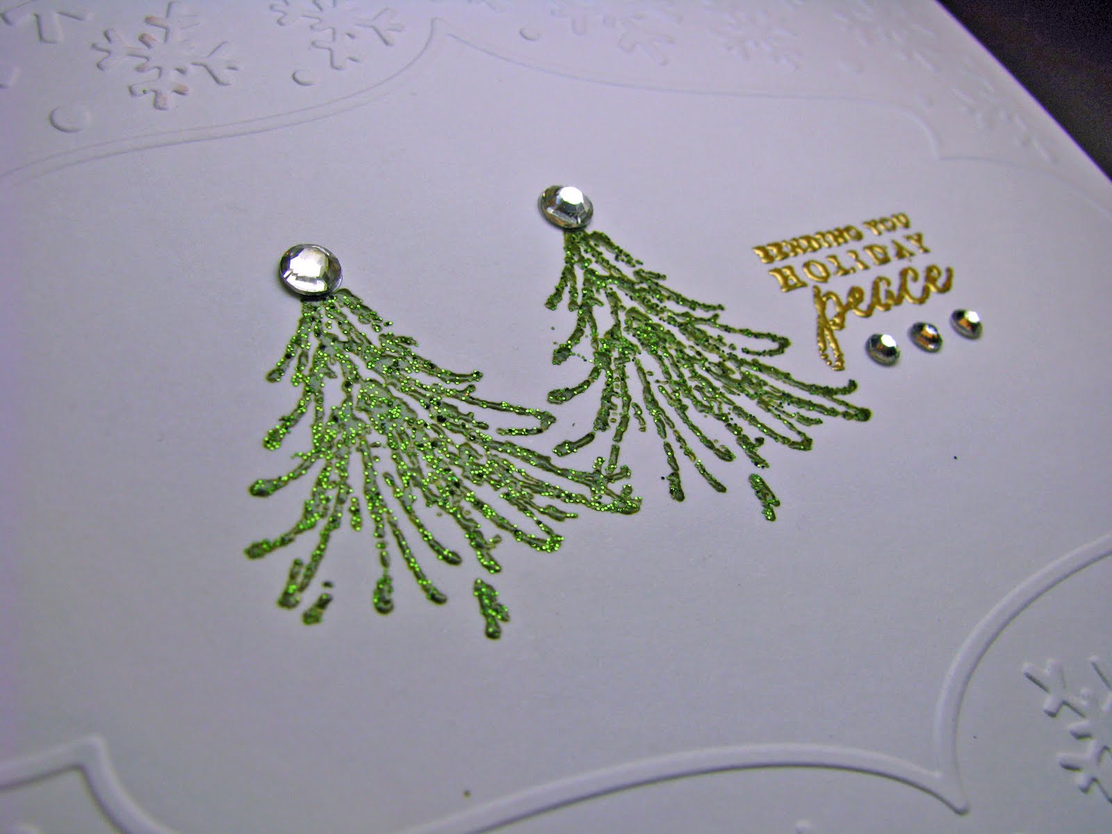
"Metallic" reminded me of embossing paste/dimensional paint that I have had in my closet for at least five years.  I made one card a long time ago and loved it.  I don't know why I tucked it away and forgot about it after that.  Actually...I do know...too many new toys and new tools and new techniques to try!!

I have embossing paste/dimensional paint from Heritage Handcrafts and from Dreamweaver.  For this card, I used Heritage Handcrafts Copper.  The paint is a perfect way to get use of of those brass embossing stencils that so many of us packed away with the introduction of the Cuttlebug!  This one is from Dreamweaver.


First, use removable tape to adhere the stencil to the paper.  Then "frost" the stencil with the paint.


Then I used my little squeegie to remove the excess paint.


I peeled up the tape and stencil and carefully added a little glitter on one side of each leaf.  Since the paint is wet, I didn't try to remove the excess yet.  


It takes half an hour to dry, then I tapped off the glitter.


It really is as easy as it seems!  As I was waiting for it to dry I checked out the Less Is More gallery for this challenge and I see that I'm not the only one who used embossing paste.  Check out #68 for a beautiful nighttime tree scene with glitter on top of the paste!

You also have to check out #75 too - last week I send a blog award to Lisa A. because I love her work and this card is a perfect example of her clean style.

Of course, I don't know why I single anybody out - this is such a fun gallery to browse - so many different ideas and all in a CAS style!

  • Stamps: Sentiment from Verve's Bountiful Harvest
  • Paper: Papertrey Vintage Cream, Stampin' Up Cajun Craze
  • Ink: Papertrey Dark Chocolate
  • Accessories: Dreamweaver embossing stencil, Heritage Handcrafts Dimensional paint, Stampin' Up border punch, misc. glitter