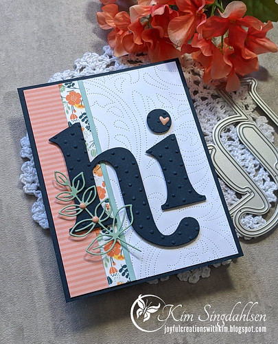
It's time for a new challenge at The Card Concept. The theme is Welcome Wee One with a fabulous nursery as the inspiration photo. I don't need any baby cards, but here's what I came up with.
The main thing I saw in this photo was the variety of patterns and colors. That's not something I'm good at. I'm very matchy-matchy. (As a proof story - about 2 1/2 years ago, we bought a new house for the first time in 30 years. I fell in love with a house. We got in a bidding war and many would say we overpaid for it. We don't see it that way. It was totally finished in ways that I adored but am truly terrible at it. Like the bathrooms have tile and flooring that aren't matchy-matchy - but are absolutely perfect together! Don't even get me started on the richly colored accent walls. My craft room has a fabulous rust wall - one of my favorites - but the living room is a calm and relaxing blue. So for us it was move-in ready and totally worth the price.)
That was a serious sidetrack! In the inspiration photo I saw stripes in the throw, a pattern in the rug (although I didn't use animal print), and the colorful curtains. I also saw a unique mix of navy (I think that's the striped throw but it might be black), peachy/pink and aquas. There's also a hint of greenery on the dresser. I pulled out a giant "hi" and added patterns and colors around that.
BTW - continuing on my theme of the last week of organizing - one of the things I did was purchase this packet organizer from Amazon (another version is on Simon Says Stamp which is where I first noticed it). I was going to use it for scraps but I ended up pre-cutting a variety of standard-sized cards and fronts, and I also added all of the white backgrounds and frames that I had created and never used. The background on this card is out of that stash.
I'm new on The Card Concept design team, but I have decided that I truly love inspiration photos. They take me in new directions. I really like my card today but it's not a card I would ever have come up with on my own. And that's why they call them challenges! I hope to see you playing along.
SUPPLY LIST
Dies: The Stamp Market Hi, Altenew Dotted Swirls Debossing Cover Die, Memory Box Scribble Leafy Branch Outline
Paper: Sunny Studio Dots & Stripes Pastel, Stampin' Up Pool Party and Mint Macaron, Taylored Expressions blue corn (the flowers are washi tape - I don't know where it's from)


WOW. wow, wow! I love everything about this, Kim! Your mix of patterns couldn't be better. So glad you'll be on the team, I always love getting to see your projects.
ReplyDeleteOh goodness your dotted swiss letters are extra sweet! This is a delightful card, Kim!
ReplyDeleteThis is one gorgeous card! And I need a debossing folder or two!
ReplyDeleteKim this is fabulous! LOve the big hi, and I spy my fave debossing plate here! You've done an awesome job of matching patterns, too.
ReplyDeleteThe Card Concept might be where I first fell in love with creating by photo inspiration! Congrats on your newest DT!
=]
I loved your card right away Kim! I have the same "HI" die and almost used it, too. All your textures and layers are perfect!
ReplyDeleteWow! What a fab card, Kim! I love this bold black sentiment paired with the sweet mix of patterns. This is such a modern touch!
ReplyDelete