Pages

Wednesday, February 29, 2012

Freshly Made: The Only Choice

Pin It
This is my last week as the guest designer at Freshly Made Sketches.  It's been so fun and so exciting but I admit to feeling a certain amount of stress each week thinking that I need to come up with something totally unique and creative.  Well...I put that all aside this week.  This week's sketch is wonderfully basic which means it is PERFECT for showcasing beautiful paper and amazing sentiments...


Most of my cards are for a church card ministry, but this one is personal.  It's heading to an amazing woman who deals with more than any of us can imagine and does it with great faith and spirit. 

Thanks so much to Lesley and the rest of the Freshly Made design team for letting me share in the fun this month!!  I look forward to playing along for a long time to come!

  • Stamps: My Favorite Things Vertical Greetings
  • Paper: Stampin' Up Peach Parfait, Soft Suede, Poppy Parade, Very Vanilla, Everyday Enchantment dsp
  • Ink: Stampin' Up Soft Suede, Baja Breeze (just sponged on the edges)
  • Accessories: My Favorite Things die, Stampin' Up embossing folder, Pool Party Seam Binding and Butterfly Embosslit


Tuesday, February 28, 2012

Merry Monday: Deck the Halls

Pin It
When Lesley at Always Playing with Paper started her Merry Monday challenge this year, with the goal of getting us a head start on Christmas cards, I swore that I would play EVERY week thus avoiding seasonal stress.  Well...she is on challenge 9 and I am on card 3.  Not great...but better than nothing!


  • Stamps: Taylored Expressions Wreaths of Joy and Banner Holidays
  • Paper: Stampin' Up Wild Wasabi, Garden Green and Very Vanilla, Cosmo Cricket Mitten Weather dsp
  • Ink: Stampin' Up Garden Green, black, copics
  • Accessories: Stampin' Up border punch and Garden Green Grosgrain, Taylored Expressions wreath and banner die, Ranger Glossy Accents, misc gems colored with copics


Monday, February 27, 2012

Razzleberry and White: He Lives

Pin It
This card is so NOT what I had envisioned when I got this stamp set!  It was going to be a classic kraft/white/subtle Easter card.  But I saw this morning's Splitcoast Clean and Simple challenge and then saw this stamp set sitting square in the middle of my craft desk - I knew it could work.  The Razzleberry adds a regal tone and the white would keep it fresh and peaceful.


The pink on the cross is actually glitter.  Have you ever noticed that "clear" glitters generally have a color cast?  I grabbed the nearest glitter and wish I would have looked more carefully.  The clearest glitter that I have found is Martha Stewart's - I buy it in giant bottles at Michaels.  This cross does not use Martha Stewart - had I stood up and walked three steps, I would have had that clear glitter.  Teaches me to be lazy!

  • Stamps: Sweet 'n Sassy He Lives
  • Paper: Stampin' Up Rich Razzleberry, white
  • Ink: Stampin' Up Rich Razzleberry
  • Accessories: Stampin' Up Razzleberry Ribbon and Scalloped Border, Sweet 'n Sassy cloud dies, Martha Stewart Butterfly Punch, Impress Sparkle Glitter


Saturday, February 25, 2012

Papertrey February Blog Hop: Interactive!

Today's monthly Papertrey Blog Hop is to make interactive cards.  Just this month, they released a series of dies to make creating interactive cards much easier.  I got mine yesterday!!


I added a subtly colored - but highly glittered rainbow on the pull up apart...


The saying is very creative.  The outer sentiment says "Beyond the clouds, behind the rain, there are a thousand rainbows."  The inside says "One is on is way to you."  Isn't that fun?


I also glittered the buttons which was Papertrey's Make It Monday video!

I have to admit - that this first card took FOREVER even with the dies.  But I understand it now and am looking forward to sitting right back down and doing another!

  • Stamps: Papertrey Movers and Shapers Sentiments, Up, Up and Away (rainbow), Faux Ribbon (thinking of you)
  • Paper: Papertrey Kraft, Spring Moss, Aqua Mist patterned paper
  • Ink: Papertrey Kraft, Spring Moss, Aqua Mist, copics on rainbow
  • Accessories: Papertrey Movers and Shapers Sliders Dies, Cloud Dies, Summer Sunrise ribbon, buttons, EK Success border punch, Martha Stewart glitter


Thursday, February 23, 2012

Less Is More: Punches or Die Cuts

Pin It
This is my second post today!

I have been off my cardmaking game this week - just not feeling it.  But this morning, I realized just how bad it was.  I had not recognized the fact that one of my favorite challenges is all about one of my favorite tools.  Less Is More challenges us to use punches and die cuts...NOT a problem!!


My card uses five dies, all from Papertrey Ink:
  1. Flower Fusion #11 die
  2. Flower Fusion Stem die
  3. Double-Ended Banners die
  4. Mat Stack #1 (the white mat)
  5. Fillable Frames #10 (the linen layer)
Thank you, Less Is More, for bringing back my enthusiasm!!

  • Stamps: Papertrey Flower Fusion
  • Paper: Papertrey Fine Linen
  • Ink: Papertrey Spring Moss, Classic Kraft
  • Accessories: Papertrey Melon Berry felt and Impression Plates
I have a favor.  I am struggling with the fact that the photos on my blog look blurry, even though they look totally clear in my photo editing software.  I have recently realized that if I made the photos extra-large (WAY bigger than any of you want to see them) they look clear to me.  

I have my regular size photo below and then the extra-large version.  I have two question (1) does one look blurrier to you and (2) if so, do you have ANY ideas why???  It seem backwards to me - I would think the smaller photo would be clearer.  Help!!


Buttons and a Sketch

Pin It

I have had this sentiment on my desk to use as it is perfect for the church cardmaking ministry...plus I love the font.  I wanted the full focus on the sentiment so when I saw that today's Splitcoast Ways to Use It challenge was buttons, I decided the buttons could simply be an interesting highlight for that sentiment.  I was struggling with how to do that so browsed other challenges and found a sketch from Pals Paper Arts.


  • Stamps: Sweet 'n Sassy Our Refuge, Polka Dot Silhouettes
  • Paper: Papertrey Ripe Avocado, Berry Sorbet
  • Ink: Papertrey Dark Chocolate, Berry Sorbet
  • Accessories: Stampin' Up Border Punch, Papertrey Ripe Avocado and Berry Sorbet Buttons, misc yellow buttons, Cuttlebug embossing folder

Wednesday, February 22, 2012

So Sweet with Freshly Made

Pin It
This stamp set has such an open and airy feeling to it, I thought it would be a perfect fit for this week's sketch from Freshly Made Sketches because that trio of squares would serve to "ground" the image.


Does anybody else struggle with "random" gems?  So many cards have those three gems that highlight the image or the sentiment.  When I study other cards, usually two are together and one is separate.  They always look like they were just plopped on - but PERFECTLY "plopped"!  I can't tell you how hard I work at getting that random, perfectly-plopped look.  I place them, pull them up, try again, and usually keep trying until the paper rips a little and I have to leave the gems where they are.  Sad, isn't it??!!

My image was a little narrower than the image area in the sketch and it made the right side look too big and out of proportion.  So I added the border punch and then backed it with a piece of dsp to fill in that side.


I also used the soft and sweet colors at CR84FN.


  • Stamps: Stampin' Up Up in the Air
  • Paper:  Stampin' Up Wisteria Wonder CS and dsp, Lucky Limeade CS and dsp, misc silver
  • Ink: Stampin' Up Going Gray pad, then I wiped off the butterflies and colored with markers in Wisteria Wonder and Lucky Limeade
  • Accessories: All Night Media butterfly punch, Stampin' Up border punch, misc gems and ribbon
- - - - - - - - - - - - - - - 

The Copic Marker Matches documents found
on my side bar have recently been revised!!

The majority of the changes relate to the 2012 Copic new marker release and to new Papertrey colors.  Here are the specific changes in case you simply want to note them on your current document or simply download/print the new version.

Copic Matches for Papertrey Ink
  1. Added Canyon Clay, a new PTI color. Papertrey selected E97, E99 and E19.  I prefer the new 2012 color, YR27
  2. Revised Fine Linen single match to be the new 2012 color, E84
Copic Matches for Stampin' Up
  1. Revised Tempting Turquoise to the new 2012 color, BG57
  2. Revised Certainly Celery to the new 2012 color, G43
  3. Added Going Gray to the retired list, W4
  4. Added Rose Romance to the retired list, R85

Friday, February 17, 2012

I Spy CAS-ual Fridays! Take 2

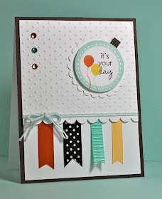
Those of you who read in Google Reader or via e-mail probably just got three copies of this and I truly apologize!!  Hopefully I have everything fixed now!

Don't you just love it when a couple of challenges work perfectly together??

This week's CAS-ual Friday challenge is to create a party card with ribbons.  Then I saw this week's sketch from iSpy Sketches.  It has ribbons!!!

Here's the card...

Check out the ribbons on the iSpy Sketch!


Before I get to the recipe - I have a very important detail....

The Copic Marker Matches documents found
on my side bar have been revised!!

The majority of the changes relate to the 2012 Copic new marker release and to new Papertrey colors.  Here are the specific changes in case you simply want to note them on your current document:

Copic Matches for Papertrey Ink
  1. Added Canyon Clay, a new PTI color. Papertrey selected E97, E99 and E19.  I prefer the new 2012 color, YR27
  2. Revised Fine Linen single match to be the new 2012 color, E84
Copic Matches for Stampin' Up
  1. Revised Tempting Turquoise to the new 2012 color, BG57
  2. Revised Certainly Celery to the new 2012 color, G43
  3. Added Going Gray to the retired list, W4
  4. Added Rose Romance to the retired list, R85

Back to the party ribbon card:
  • Stamps: Papertrey Ink Tag Its
  • Paper: Papertrey Ink Dark Chocolate, white
  • Ink: Papertrey Ink Dark Chocolate, Canyon Clay, Harvest Gold, Aqua Mist
  • Accessories: Papertrey ribbon in Dark Chocolate, Canyon Clay and Harvest Gold, misc ribbon to match Aqua Mist, Stampin' Up Pool Party twine, Stampin' Up Scalloped Border punch, Cuttlebug embossing folder, gems and Copics to color them to match

Thursday, February 16, 2012

U Are Amazing

Pin It

Today's card plays along with three challenges: the Splitcoast Sketch Challenge, the Sweet 'n Sassy Wednesday Challenge (as found on Splitcoast) which is to do reverse masking, and the  Color Throwdown.


I like the subtle colors with just a pop of Poppy!  And I always like the look of a little sponging because you can go lighter in the middle and give it a "glow" - although I should have kept the "glow" lower so "amazing" stood out!!

The sketch:

The colors:


  • Stamps: Sweet 'n Sassy You
  • Paper: Stampin' Up Crumb Cake, Poppy Parade, Blushing Bride
  • Ink: Stampin' Up Crumb Cake, Blushing Bride, Chocolate
  • Accessories: Stampin' Up Embossing folder and flower punch, misc leaf punch, Martha Stewart glitter blue, misc red ribbon

Wednesday, February 15, 2012

Sweet 'n Sassy: Special Gift


This is my second post today.
It's just a short scroll down if you are
looking for Freshly Made Sketches.

This is a copy of my post for today over on the Sweet 'n Sassy blog.

I have had a sweet little girl on my mind today.  She is ALWAYS in my prayers as, at the age of 7, she has spent most of her life in and out of chemo.  She and her family are on our local newscasts today because one of the drugs that she needs for this round of chemo is part of the nationwide drug shortage that's been in the news lately.  This is an incredibly inspirational family - so full of faith - they are always a shining light in our church family.  My small contribution is to always make sure there are cards waiting for them after a chemo week.

That's a long explanation for this card because I had a very specific goal.  I wanted it very clean and "pure" - thus the white scenery.  And I wanted this girl and her kite to be vivid and cheerful!
Pin It

But most of all, I wanted to remind this sweet girl that she is a very, very special gift from God!!

  • Stamps: Sweet 'n Sassy Special Friends
  • Paper: Stampin' Up Regal Rose, white
  • Ink: Memento Black and Copics
  • Accessories: misc dies and punches

Freshly Made: Lift You Up

Pin It
When I saw today's sketch from Freshly Made Sketches, I immediately thought of a film strip.  So I did a series of "photos" from a playground...


I love the sentiment that came with this digital image!  It's from a series of playground images from Wax Fruit Company.  The image on the left has a girl in a tree swing  and the one on the right is a girl flying a kite.  There is also a baseball image.  Each one has an appropriate sentiment.  They are all darling!!

Here is this week's sketch...


  • Stamps: Wax Fruit Company digitial images
  • Paper: black and white
  • Ink: copics
  • Accessories: misc buttons


Tuesday, February 14, 2012

Colors: Cards for My Boys #2

Pin It

Here it is...Valentine's Day morning...and I am only just finishing cards for my boys.

Today's Splitcoast Color Challenge hostess said that she probably should have picked Valentine's colors but she was very tired of reds and whites.  Thank goodness, she at least picked masculine colors!!


My youngest son was the first to say "Dude" so he got yesterday's card.  This is for my oldest son.  I know that there is probably an "adult" implication with "Legendary" on a Valentine - but I picked it for him because of a character on one of his favorite shows who says "legendary".  (This kind of strange logic is what happens when you have and hour and a half to finish the entire family's Valentine cards)

I had planned to do three simple masculine Valentines because I still have my husband's to go...but as I look at the clock, I think I will be CASing his card from someone else.  Shhh...don't tell him!


  • Stamps: Close To My Heart Legendary Moments
  • Paper: Stampin' Up Night of Navy, Bashful Blue, Crumb Cake
  • Ink: Stampin' Up Crumb Cake, Night of Navy
  • Accessories: Stampin' Up Fashionable Hearts Embosslit, Navy Grosgrain, Tim Holtz embossing folder

Monday, February 13, 2012

CAS: Cards for my Boys #1 (and a niece!)

Of course, I have waited until the last minutes to do Valentine cards for my boys!  I knew when I woke up, that  I was going to HAVE to rely on clean and simple challenges today to get the cards done.  Here's my first card for the day - it uses Splitcoast's Clean and Simple sketch challenge.  I'm not sure which son is going to get this card - I think I am just going to see who says "Dude" first!
Pin It


The Dud stamp actually says "That is so cool". I found a small font and added the "UR" so it could work as a Valentine.

For a little clean and simple bonus, I want to show you the card that I made for my sweet little niece.  This card is a total rip-off CASE of this charming card by Laura!  You have to check her card out - it is so bright and cheerful!
Pin It

DUDE:

  • Stamps: Stampin' Up So Cool, sentiment from WPlus9 Bird set
  • Paper: Stampin' Up Poppy Parade, black and white
  • Ink: Stampin' Up Poppy Parade, black
  • Accessories: Stampin' Up Scalloped Heart of Hearts Embosslit, Fashionable Hearts Embosslit, Papertrey Ink Woodgrain background, misc black button
BEAR HUGS:
  • Stamps: Sweet 'n Sassy Love from Rhubarb
  • Paper: Stampin' Up Pink Pirouette, Pretty in Pink, Real Red, Going Gray, Love Impressions dsp
  • Ink: Memento black, copics
  • Accessories: Martha Stewart heart confetti punch, gems

Friday, February 10, 2012

Two Looks for Tender Words

Every Friday, Sweet 'n Sassy Stamps is doing a look back at older sets.  Today, I contributed two cards for the set Tender Words.

The first is soft and sweet.  I will be using this as an Easter card...
Pin It

Then in an entirely different direction, I also made a sympathy card.
Pin It


I love sets with multiple uses!!

Easter card:

  • Stamps: Sweet 'n Sassy Tender Words
  • Paper: Stampin' Up Blushing Bride, Pear Pizzazz
  • Ink: Memento black and copics
  • Accessories: Sweet 'n Sassy Lacey Eyelet Border die, misc ribbon
  • Challenge: Sketch from Technostamper

Sympathy card:
  • Stamps: Sweet 'n Sassy Tender Words
  • Paper: Stampin' Up Crumb Cake, So Saffron, Black
  • Ink: Memento black, colored pencils
  • Accessories: Stampin' Up border punch and thin black ribbon, misc button
-------------------------------------------

The Easter card is for the Technostamper Sketch Challenge.  Mary Jo provides the code for me to show you all the other entrants in the challenge - it becomes a blog hop! 


Thursday, February 9, 2012

He Is Risen!!

Pin It

I just got a Stampin' Up order and HAD to find an excuse to use this beautiful stamp.  I've stated many times that I am a cardmaker that needs a starting point - sketch, colors...something.  So I found a sketch by one of my favorite cardmakers that she made for a new sketch challenge at Scrapbook Essentials BC.  I cheated a little as I didn't add a sentiment at the bottom, but I like the focus that the sketch puts on the stamp...


What would be perfect on this card is little gold beads or pearls at the base of each scallop to beautifully frame the image.  But my cards are for our church card ministry and the addition of 20+ beads on each of the four cards we make of this design becomes costly.  I think that's part of the reason I tend toward simple cards - I am always watching the bottom line!  (Of course, my husband regularly points out - and probably accurately - that if I gave the money to the church that I spent on my supply stash, they would make more than they do through the ministry.  But what would be the fun in that!!?)

Here's a close-up of the touch of glitter that I added to the dove...


  • Stamps: Stampin' Up Easter Dove
  • Paper: white
  • Ink: Versamark
  • Accessories: Cuttlebug embossing folder (dots), Sizzix embossing folder (leaf), misc ribbon, detail gold embossing powder

Wednesday, February 8, 2012

I Spy PTI and Pinterest!

Pin It
This is my second post today -
it's just a short scroll down for
Freshly Made Sketches!

A new sketch challenge - iSpy Challenges.

A big prize package - Papertrey Ink's 5th Anniversary.

And a new addiction for me - Pinterest - more on this later.


This week is the FIRST sketch from iSpy Sketches.  Sketch challenges are my favorite so I had to give this one a try.  Plus, when I decided to do a baby card - those three little bows across the bottom were a perfect fit!


This month is full of festivities for Papertrey Ink's fifth anniversary with HUGE prize packages.  Today they are focused on colors and the prize includes all their buttons, all their felt, all their ribbons...oh my gosh!!  Each of their designers gave their favorite color combos and I picked Erin's as it was a very different combo than I would normally use for a baby card!

Let me give you the facts of the card, then I am going to RAVE about Pinterest!

  • Stamps: Papertrey Ink Hanging Out, Little Bitty Birds, Tiny Tags II (sentiment)
  • Paper: Papertrey Ink Simply Chartreuse, Pure Poppy, Summer Sunrise Bitty Box Basics
  • Ink: Papertrey Ink Aqua Mist and Fresh Snow
  • Accessories: Papertrey Ink felt in Summer Sunrise and Pure Poppy, Papertrey dies: border die, bird die, hanging out die, Cuttlebug embossing folder, misc ribbon to match Summer Sunrise.
Now...on to my new addition...Pinterest.

I finally took the time to figure out what Pinterest was and I am now TOTALLY addicted.  I'm sure it is different things to different people - but what it is to me is a place to store all the techniques, templates, card folds, coloring ideas, etc. etc. that I find online.  That's really all it is - a place to store info that you find online with a focus on the picture.

So, I have been working my way through my hundreds of bookmarks for card ideas and have transferred about a hundred to Pinterest (with 100+ to go).  If you click on the Pinterest button on my sidebar, you can see what I have there so far.  I have a section for amazing effects with ink, for templates, for fancy folds, for dimensional projects, etc.  Then...if you like what you see, you can click on the link and you go right to the website to get the instructions!!  How cool is that!!!

My main focus is on the cards that require a tutorial or an extensive explanation - I store all the other cards that I love and find inspirational on my iPad.  Having said that, I have pinned a few cards to My Favorites - those are just basic cards that I love.  This section will grow but please realize, particularly if you know that I follow you, that I am not going to put many basic cards there as I have other places to store those.

Besides my stuff, there is a very active cardmaking community on Pinterest, and you will likely very quickly want to Re-Pin ideas onto your own board.  That just means you love the idea and want to keep under your own section so you can find it later.  Signing up for Pinterest is invite only - but just let me know and I will invite you.

If you are already a Pinterest user - I have tried to make life easier - and you will notice a Pin It button on my posts.  I've been "user" for a few weeks now, but you should have seen my happy dance yesterday when I suddenly realized others have pinned my cards.  I felt like I was having my 15 minutes of fame!!

Try it out...have fun...and I do hope you enjoy what I have pinned so far and will come back for more!

Freshly Made Sketches: Both Way Blossoms

Pin It

I just recently come across the Stampin' Up set, Both Way Blossoms, hiding deep in my stash and when I find a "lost" set, I have to use it because there is some chance it has never been used before!!

Lucky for me, there are tall panels on this week's sketch at Freshly Made Sketches...


This card did NOT come together easily.  I started down a different color path.  This is my first card...


Is anything totally wrong with the above card?  Not necessarily.  But as a personal preference, I am NOT a fan of Always Artichoke.  It seems "dead".  I tried an interesting embossing folder to give it some life - but it just didn't work.  This card needed to be lightened up and given some life!  To accomplish this...

  • Obviously, I used newer colors and gave it a much fresher look.  This alone might have been enough.
  • The addition of a touch of black adds vibrancy to any color.
  • I like borders on my card.  I see many other cardmakers make cards without borders and I LOVE their cards.  But somehow, every time I try a card without a border it doesn't seem contained...it doesn't "end" and it bothers my eyes.  A frame makes a huge difference and in this case, a black and white frame allowed me to use a fun gingham ribbon.


As a VERY bizarre side-note....every time I use Stampin' Up Whisper White cardstock, my photos look blurry. It's like the slight sheen on the cardstock affects my camera.  I typically use Neenah Classic Crest and my photos are crisp and clean (I make cards in bulk and it's much cheaper to buy a ream from an office store). Has anybody else noticed this and is there anything I can do to fix it?

  • Stamps: Stampin' Up Both Way Blossoms, Well-Scripted
  • Paper: Stampin' Up Lucky Limeade, Poppy Parade
  • Ink: Stampin' Up Lucky Limeade, Poppy Parade
  • Accessories: May Arts gingham, Martha Stewart butterfly punch, Cuttlebug embossing folder, Spellbinders heart circle

Monday, February 6, 2012

Splitcoast Clean and Simple: Hearts

Pin It

Today's Splitcoast CAS Challenge  was simply "hearts".

I took them seriously and went for the plural...lots and lots of hearts!


Sweet 'n Sassy stamps has a Heart Die Set and when you get it all of the hearts are together.  I suppose you could twist them apart - but I kept them together simply so I wouldn't lose the small ones.  I'm so glad that I did because it worked so well for this card!

On my last post, I showed you a picture of the snow drift outside of my craft window - and while many of you commented on the snow - a number of you commented on the cute cat in the picture.  So I had to show you the other "animals" in my zoo.  These are my boys watching the Super Bowl and my other two pets watching the popcorn!


  • Stamps: computer generated
  • Paper: white, SU Real Red CS and dsp
  • Ink: none
  • Accessories: Sweet 'n Sassy Heart Die set

Saturday, February 4, 2012

Happy Birthday Less Is More!!

The fabulous challenges at Less Is More is now one year old!  Happy Birthday!  The challenges are always fantastic.  The inspiration by Chrissie and Mandi is gorgeous and so very creative.  But the best part is all of the participants - it's amazing how many different and fabulous cards come out of a simple challenge.

This week's challenge is a repeat of the very first challenge.  It's a color challenge...aqua...


I knew instantly what I was going to do - I wanted to look through a "window" at these beautiful butterflies.  It was an instant decision because here is what I am looking at out my real window...


That pile IS a snow drift!

Just Thursday night, I was whining during an online release party that schools were closing in advance of a blizzard and, at that time, there was no snow on the ground and it wasn't snowing.  Well, it snowed...and it is still snowing.  My area was on the low side for snow totals - only 16" - but lots of wind thus the drifts.  There's a town closer to the mountains that got 50".  Wow!!

At some point today, I need to try to get out of the house.  We had church cardmaking on Thursday night (when it wasn't snowing).  I always leave everything set up with all of my supplies because we gather again on Friday afternoon. Not this time.  So a huge quantity of my supplies are the church - over half my ink (thank goodness, I had aqua here) and my Cuttlebug are what I am missing the most. (The window on today's card is actually the scrap left from a circle that I cut when I actually HAD my Cuttlebug!)  My man/boys are going to be thrilled when they get up and I set them to shoveling so that I can get my cardmaking supplies!!

  • Stamps: Sweet 'n Sassy Butterfly Flourish
  • Paper: white, SU Bermuda Bay
  • Ink: SU Pool Party, Bermuda Bay
  • Accessories: misc ribbon, white Scrapper's Floss, Martha Stewart butterfly punch


Friday, February 3, 2012

I {heart} You (with three hearts!)

At last night's Sweet 'n Sassy release party, there was a challenge to make a love-themed card - and since it is the month of love, I HAD to play along!


I also wanted to play along with the Pals Paper Arts challenge to use reds.  There are actually three different reds on those hearts but no matter how I adjusted my lighting, I just couldn't get a great photo.
  • Stamps: Sweet 'n Sassy You, Polka Dot Silhouettes
  • Paper: black and white
  • Ink: SU Ruby Red, Real Red, Poppy Parade
  • Accessories: Sweet 'n Sassy heart dies, SU Red button, misc. gems colored with Copics, Cuttlebug embossing folder

Thursday, February 2, 2012

Coral and Ruby Greenhouse Flowers


This is my second post today -
it's just a short scroll down for the 
Sweet 'n Sassy blog hop!


Two challenges/inspirations came together that caused me to pull out this Stampin' Up set - Greenhouse Garden.  First, I saw Ann's card - such a lovely one layer card.  Then the clean&simple sketch challenge perfectly fit the idea of three flowers! I went for one of my favorite color combo - sadly, now retired...


  • Stamps: Stampin' Up Greenhouse Garden, Papertrey Flower Fusion 6 (sentiment)
  • Paper: Stampin' Up Ruby Red dsp (retired)
  • Ink: Stampin' Up Cameo Coral and Ruby Red (both retired)
  • Accessories: Spica black glitter pen (dotted on the centers), misc gingam

It's Here! It's Blog Hop Day!!


Welcome to the Sweet 'n Sassy Stamps February New Release Blog Hop!  This month's release is so exciting  - it was even released a week early as a surprise! Get your warm beverage and tasty snack, and get ready for some amazing inspiration from the Design Divas!
I love this hop because I am surrounded by incredibly talented cardmakers and I love seeing what they have done (and I have the same stamps so I can CASE them all!!)
You probably came from Korin's blog but if you started with me, you should head back to the Sweet 'n Sassy Stamps Blog to start from the beginning.
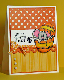
I have two ENTIRELY different sets to show you today.  The first is charming little Cocoa popping out of an Easter egg...


This set is called Egg-Cited Cocoa.  I used Echo Park Dots & Stripes, also available in the store.  And the heart die is also from Sweet 'n Sassy - the Hearts and Stars Scallop Border.  (The layout is from a sketch found at Cardabilities.)
Then on an entirely different note...


It's the Rose Collage set and it is gorgeous.  There are 16 different sentiment to go inside the banner so it is completely flexible.  The two butterflies are on the main collage stamp - but there are also two separate stamps so it is easy to stamp and cut out.  (The colors are from colourQ.)
Next...for your hopping pleasure...is Giovana.  Have fun!


Be sure to make plans to join us for our new release party tonight; the fun takes place over in our member company forums on Splitcoaststampers.  We'll have great fellowship with crafty friends, challenges, and a prize drawing!  The excitement starts at 8:00 PM EST.
Now, take a look at what the other Design Divas have created to show off this amazing batch of February stamps:


Don't forget, the entire February release is available in the store right now; you can order the stamps individually or at a discounted bundle price!  Head over to get yours today!


The challenges that I used are: