Pages

Wednesday, July 29, 2015

Freshly Made Sketches: An Owl Hello

It's time for a new sketch at Freshly Made Sketches! Today we have a sketch by Jen Brum.


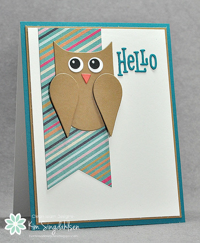
I recently realized that my stash of never used dies is bigger than my stash of never used stamps, so I went digging through the pile for a square-shaped die to use on this sketch.  I did find squares, but I also found this charming owl that has been unused for way too long!

An Owl Hello

I was making this card Sunday evening and it was one of those rare times that my entire family was also hanging out.  I asked them what color an owl's nose was and they all looked down at their phones/tablets/computers and almost simultaneously said "black".  So I said that I really needed to add a bit of color to this guy and, bless their hearts, they looked up "orange beaked owls" and there is an owl with an orange beak!  There's nothing like participatory card-making with my husband and teenage boys!!

Besides the Memory Box owl being a never used die - I also just got the hello.  It's an older die from WPlus with three speech bubbles and the words "hi", "hey", "hello" in the bubbles.  I had never paid much attention to it until I saw the "hello" used recently on a charming card.  Isn't it funny how that works?  I have the same problem with the annual Stampin' Up catalog.  Each summer when I go through the new catalog, my wishlist is often more full of old product than with new product.  I think it's just because the set is displayed in a different way, or I love the sample card, or perhaps in the old catalog it was displayed on a page with another set that distracted me, but somehow a stamp set that has been around for a year suddenly appears on my wishlist.  (Or maybe I'm just never satisfied and want everything I see!!)


Have you heard the big news?  Mark your calendars - this is going to be big!


Be sure to check out the inspiration from the rest of the design team on the FMS Blog and also spend some time browsing Jen's blog, Ladybug Designs.  Then play along - I'd love to see what you create.

SUPPLY LIST


Wednesday, July 22, 2015

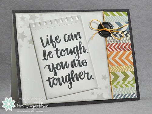
Freshly Made Sketches: Life Can Be Tough

It's time for a new sketch at Freshly Made Sketches! Today we have a sketch by Cindy Hall.


When I sat down a few days ago to make this, I knew that I needed words of encouragement for my oldest.  As a new high school graduate, he's starting to get a dose of the real world and it's really got him down.  Does anybody remember that moment when you realized that many people really don't care about their jobs or about the people around them?  I kind of hate to destroy his outlook and tell him to get used to it, but life IS tough and it's not always fair. 

I had purchased this sentiment set with this situation in mind.  I knew at some point, he'd be caught off guard by real life. 

Life Can Be Tough

It's so hard to make for teenage boys.  I put heart and soul into his graduation card.  I bought a sentiment set with just the right sentiment that I thought would speak to him and guide him through the next few years.  That card is still crumpled and muddy on the floor of the car.  On the other hand, I know he has a plastic box in the drawer next to his bed, and I know it includes a variety of cards that I and others have given him over the years.   I'll let you know where this card ends up!!

FYI - I can't believe I hadn't used the Stampin' Up Perpetual Birthday Calendar set yet.  I didn't get it for calendar purposes, I got it for the little sprinkles.  I don't think this picture does it justice - but these sprinkles look so dimensional when randomly stamped with lighter and darker colors.  

Be sure to check out the inspiration from the rest of the design team at the FMS challenge blog. Also check out Cindy at Pretty Impact - you'll love her work!

SUPPLY LIST

Tuesday, July 21, 2015

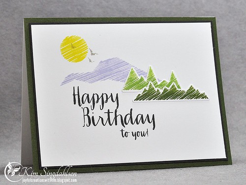
Happy Birthday Mountains!

When I was thinking about a birthday card for a wonderful man, I quickly decided it needed mountains.  He lived for years in my favorite all-time mountain town and they still go regularly for mini-vacations.  I count his wife as a dear friend - we spent a wonderful afternoon not long ago wandering around that town and I realized that the family was an institution.  Everybody knew her and she showed me hidden gems throughout the town. My foodie son counts one of the restaurants she pointed as his second favorite restaurant!!

I pulled out the WPlus9 set Encouraging Words and added a birthday sentiment from Strictly Sentiments 5.  I love the scenes that can be built with the images in Encouraging Words.

Happy Birthday Mountains

I created purple mountains, but I originally saw the set used with that stamp as a lake - check it out here.  It's gorgeous either way.  She also used one of the images that I used as trees as a misty mountain background.  I so love flexible sets.

Happy Birthday Ken!!  Carol, we need to find time for coffee!

SUPPLY LIST

FYI - I used different areas of the Ombre pad to get the different greens.  I was hoping for a little more variation on the image - but it just doesn't show up well.  

Wednesday, July 15, 2015

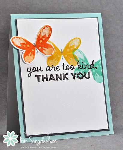
Freshly Made Sketches: You Are Too Kind

It's time for a new sketch at Freshly Made Sketches! Today we have a sketch by...me!!


It's a little nerve-wracking to put a sketch out there and hope that people like it enough to play along. But at the same time, it's very fun to see what you all do with it.  I hope you enjoy it.

I very carefully added the "any shapes" phrase to the sketch because I knew that I wanted to use butterflies - specifically the new Watercolor Wings from Stampin' Up.

FMS Too Kind

Be sure to check out the inspiration from the rest of the design team.  Just pop over to the Freshly Made Sketches blog.  And then I hope to see you play along!

SUPPLY LIST

I did use three retired Stampin' Up inks: Peach Parfait (with Pumpkin Pie for the orange butterfly), Coastal Cabana (with Pool Party for the blue butterfly), and Going Gray for the butterflies.  Also, you'll see that I used Papertrey's Smokey Shadow for the dark gray - I think a dark gray is the one thing that is missing from the Stampin' Up color line-up.  My Basic Gray ink is dark - but the paper isn't - so I tend to regularly bring out Smokey Shadow.


Saturday, July 11, 2015

For FLICKR users - a workaround

Are you a FLICKR user and annoyed at FLICKR right now?

I use FLICKR to store the photos for my blog and then I use their HTML embed code to add the photo to my blog.  I originally did it because I thought photos done that way were crystal clear and I had a real problem getting clear photos if I loaded directly from my computer.  (Long story - but blogger's algorithms to format photos don't play well with whatever camera settings I was using for my photos.  After researching and trying about 100 different settings to make it better - I got tired and moved to FLICKR where I was already storing my personal photos anyway.)

In the last week, FLICKR announced a change that they were excited about.
Today we’re excited to start rolling out a new version of our HTML embed code, with more visible attribution of the photo owner and enhanced features.  
But they have taken a ton of heat in their forum because most users weren't as excited.  Here's what a photo looks like if you just keep uploading in the regular way.  (BTW - the junk on the top and the bottom doesn't show up when you are writing your post - only when you preview or publish, so you might not have noticed what's going on. Also, the stuff I'm talking about doesn't show up in many blog readers like Feedly.  But if your readers go directly to your blog, they will see it.)
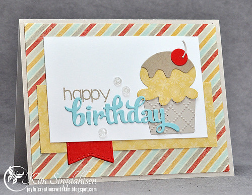
RC Ice Cream For Sweet Sunday

I pay for FLICKR - I really don't want to be forced to advertise.  PLUS, my photo title and comments at the bottom are intended for FLICKR users - they direct people back to my blog.  I don't want that same comment actually on my blog.  And it looks worse if you don't rename your photos - your title would show up as DSC_0045 or whatever gobbledy-gook your camera uses.  I've also read that this new stuff really slows down the loading of your blog for your readers.

It's a pain, but you can actually get rid of it.  Hopefully FLICKR listens to the annoyed users in their forum and we won't have to do this for long.

Here's the new code you get when you want to embed a photo from FLICKR.  It usually comes all together in a string, but I have broken it down for demonstration purposes and I have highlighted the offending portions.


<a
data-flickr-embed="true" data-header="true" data-footer="true" 
 href="https://www.flickr.com/photos/70360263@N03/18532466199/in/album-72157629759927271/" title="RC Ice Cream For Sweet Sunday"><img src="https://farm1.staticflickr.com/419/18532466199_a19c372b4f.jpg" width="500" height="387" alt="RC Ice Cream For Sweet Sunday"></a>
<script async src="//embedr.flickr.com/assets/client-code.js" charset="utf-8"></script>


Just get rid of the highlighted portions!  You want your code to start with "<a href" just like it did before and you want to get rid of the script stuff at the end.  My code would look like this.


<a href="https://www.flickr.com/photos/70360263@N03/18532466199/in/album-72157629759927271/" title="RC Ice Cream For Sweet Sunday"><img src="https://farm1.staticflickr.com/419/18532466199_a19c372b4f.jpg" width="500" height="387" alt="RC Ice Cream For Sweet Sunday"></a>


And my photo goes back to looking like it did before!

RC Ice Cream For Sweet Sunday


Just for completeness - I need to tell you that I don't know HTML - I just wanted to put the code back to the way it looked before, so I started deleting stuff.  The "official" comment in their forum directs you to change "true" in the code so that data-header="true" and data-footer="true" both equal "false".  It does work, I just found it to be a much bigger pain than simply deleting.

Hope this helps!
Friday, July 10, 2015

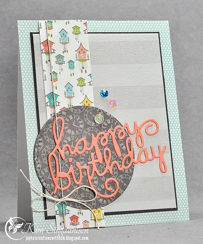
Happy Birthday Stacey

It's Stacey Schafer's birthday, one of my favorite bloggers!  And one of the blog-world people I have had a chance to meet!  Happy birthday friend!!

Untitled
Girl's weekend in Chicago, 2014

I have learned many things from Stacey and from Stacey's cards.  She introduced me to hemp twine - she even showed me how to twirl it around fingers to get a multiple bow.  She got me hooked on sequins.  The one thing she hasn't quite taught me is the use of patterned paper.  Patterned paper scares me - at least if I'm supposed to use more than one simple pattern.  Stacey can add multiple and very varied patterns to her cards and it looks fabulous.  I can buy the same papers, try to make a card with her sample card right in front of me - and I still can't make it look right!

For my birthday card to Stacey - I used twine and sequins, and I did challenge myself to use multiple patterns - three patterned papers and one big striped stamp.

HB with Papers

I'm actually happy with the paper on this, but true confession time.  This is not the actual card that I sent to Stacey.  I took pictures of her card, but didn't look at them before mailing the card and they were blurry.  I decided to remake the card because I really wanted to do this post today - but first, I ran out of some of the papers, and second - the original card had a rather unfortunately placed flower. I was clearly trying to squeeze a bunch of new stuff onto the card. 

Hey Stacey - celebrate well!!

SUPPLY LIST